Curtain Color Contrast Calculator
Choose Your Colors
When you’re picking out curtains, one of the most confusing questions is: should they be darker or lighter than your walls? It’s not about following trends-it’s about how light, space, and mood work together in your room. The answer isn’t one-size-fits-all. It depends on what you want the room to feel like, how much natural light it gets, and even the time of day you spend most of your time there.
Lighter curtains make small rooms feel bigger
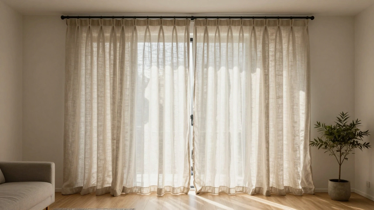
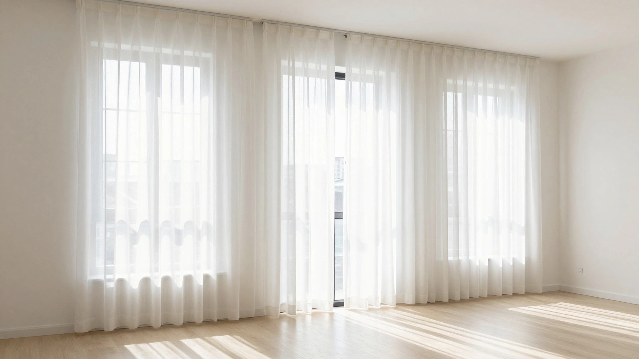
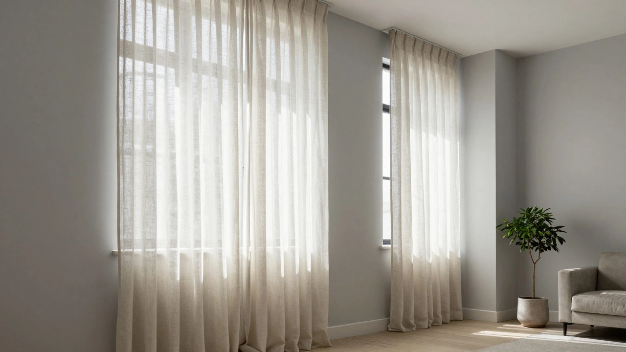
If your room feels cramped or has low ceilings, going with curtains that are the same color or lighter than your walls is the easiest way to open it up. Light-colored curtains-think ivory, soft gray, or pale linen-reflect light instead of absorbing it. This helps the space feel airier and more connected to the outside. In Melbourne apartments with narrow windows or limited sunlight, this trick works every time. A study by the Australian Interior Design Association found that rooms with light window treatments were perceived as 15% larger by occupants, even when square footage stayed the same.
Pair light curtains with white or off-white walls for a clean, calming look. If your walls are a warm beige, try a curtain in a slightly lighter shade. The subtle difference creates depth without breaking the flow. Avoid stark white curtains on white walls, though-that can look flat. Add texture with linen, cotton voile, or a slight sheen to give the eye something to rest on.
Darker curtains add warmth and drama
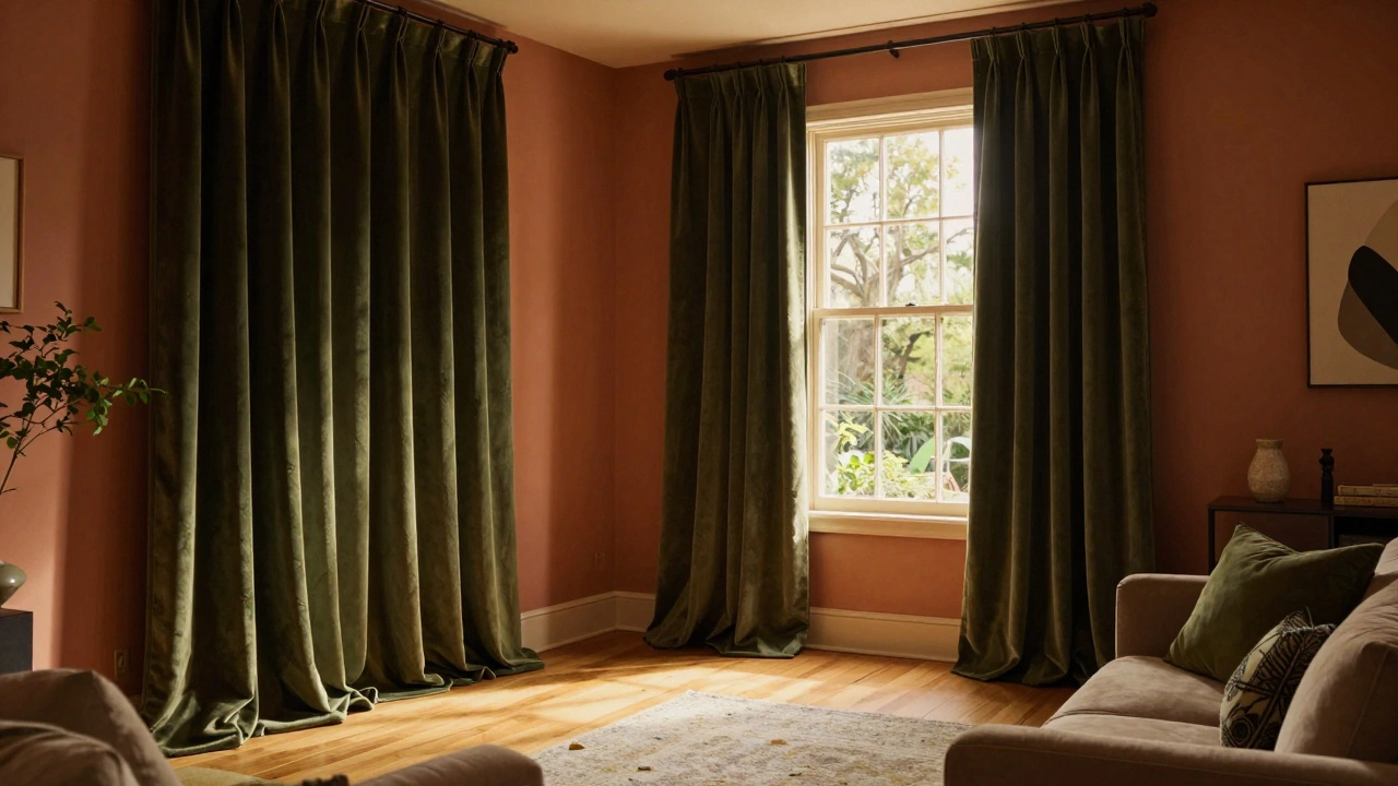
Darker curtains don’t just block light-they change the whole energy of a room. If you’ve got a large, bright space that feels too sterile, a deep navy, charcoal, or forest green curtain can ground it. Think of it like adding a velvet jacket to a plain white shirt. It doesn’t overpower; it elevates.
This works especially well in living rooms, bedrooms, or home theaters where you want to control light and create a cozy, intimate feel. In Melbourne’s winter months, when days are short and skies are gray, dark curtains make rooms feel like a warm hug. They also help with insulation. A 2024 energy efficiency report from the University of Melbourne showed that heavy, dark drapes reduced heat loss through windows by up to 25% compared to thin, light fabrics.
Just make sure your walls aren’t already dark. If your walls are a deep taupe or charcoal, going darker with curtains can make the room feel like a cave. Instead, pick a shade that’s one or two tones deeper than the wall color. That way, you get contrast without suffocation.
Match the mood, not the color
Color isn’t the only factor. Texture and pattern matter just as much. A heavy, textured velvet curtain in a medium tone can look richer than a flat, dark fabric-even if the color is technically the same. Likewise, a light curtain with a bold geometric print can feel more dominant than a solid dark one.
Ask yourself: what’s the room for? A nursery might benefit from soft, light curtains that let in gentle morning light. A home office might need darker curtains to reduce glare on screens. A dining room? A rich, dark curtain can make dinner feel like an event, not just a meal.
Don’t force a rule. If your walls are a bright white and you love deep burgundy curtains, go for it. The key is balance. If the curtains are bold, keep the rest of the room quiet-simple furniture, neutral rugs, minimal decor. Let the curtains be the statement.
What about patterns and prints?
Patterned curtains add another layer. If your walls are plain, a patterned curtain can become the focal point. But if your walls already have texture-like a subtle wallpaper or exposed brick-stick to solid curtains. Too much visual noise makes a room feel chaotic.
When choosing patterned curtains, match the dominant color in the pattern to your wall color. For example, if your walls are light blue and your curtain has a floral print with navy, sky blue, and cream, the navy and cream will tie into other elements in the room. The blue in the print echoes the wall, creating harmony without matching exactly.
Never pick a curtain pattern that’s busier than your wall. It’s like wearing a loud shirt with a loud tie-you’ll end up looking like a confused traffic light.
Lighting changes everything
Colors look different at different times of day. A curtain that looks perfect in the afternoon sun might feel too heavy at night under artificial light. Always test your curtain fabric in the room at different times. Hang a swatch next to the wall for a full day. Watch how it changes from morning to evening.
North-facing rooms in Melbourne get cool, even light all day. Light curtains here will feel washed out. Go for medium tones with warmth-like oatmeal or sage-to add depth. South-facing rooms get bright, direct sun. Dark curtains here can fade faster. Choose fade-resistant fabrics like polyester blends or blackout-lined cotton.

Real examples that work
Take a small Melbourne studio with pale gray walls. Adding linen curtains in a slightly lighter shade-almost white-makes the space feel taller and brighter. The result? It looks like a designer show flat.
Now picture a large, open-plan living area with warm terracotta walls. A deep olive green curtain adds richness without competing. It ties into the wooden floor and the pot plants on the windowsill. The room feels grounded, not empty.
And here’s a mistake I’ve seen too often: someone picks a curtain that’s the exact same color as the wall, thinking it’ll be seamless. Instead, it disappears. The window feels like a hole in the wall, not a framed feature. There needs to be a gentle contrast-just enough to define the space.
What to avoid
Don’t pick curtains based on a photo you saw online. Lighting, scale, and materials vary wildly. A curtain that looks stunning in a sunlit California loft might look gloomy in your Melbourne kitchen.
Avoid curtains that are too heavy for the window size. A massive, floor-to-ceiling curtain on a small window looks like a costume. Keep proportions balanced.
And never buy curtains without seeing the fabric in person. Online swatches are unreliable. A color called "sage" on one site is lime green on another. Visit a local store. Hold the fabric next to your wall. Take it home for a day. Let the light decide.
Final rule: contrast, don’t match
The best curtain-and-wall combinations aren’t matched-they’re coordinated. Light curtains on dark walls? Yes, if you want drama. Dark curtains on light walls? Yes, if you want warmth. But if both are too similar, you lose definition.
Think of it like shoes and jeans. You don’t wear black shoes with black jeans unless you’re going for a very specific look. Usually, you want a little contrast. Same with curtains and walls.
Here’s a simple trick: pick your curtain color first. Then choose a wall color that’s one shade lighter or darker. That way, you’re building from the statement piece, not trying to fix a mismatch later.
There’s no perfect answer. But there is a smart one. Let your room’s purpose, light, and your own comfort guide you-not Pinterest.
Should curtains be the same color as the walls?
Generally, no. Curtains that match the wall color exactly tend to disappear, making the window look like a hole in the wall. Instead, choose a shade that’s slightly lighter or darker to create subtle contrast and define the space. A small difference in tone adds depth without clashing.
Do dark curtains make a room look smaller?
Not necessarily. Dark curtains can make a large room feel cozier, not smaller. In small rooms, they might feel heavy if the walls are also dark. The key is balance: use dark curtains on light walls to create contrast and depth, or in large, bright rooms to add warmth and reduce glare.
Are light curtains better for bedrooms?
Light curtains are great for bedrooms if you want natural light to wake you up gently. But if you need total darkness for sleep-especially in summer when the sun rises early in Melbourne-opt for blackout-lined curtains in a medium or dark tone. Light curtains alone won’t block enough light for deep sleep.
Can I use patterned curtains with patterned walls?
It’s possible, but risky. If your walls have a subtle texture or print, stick to solid curtains. If your walls are bold-like a large floral wallpaper-choose a simple curtain with a color pulled from the pattern. Too much pattern creates visual chaos. Let one element lead.
How do I choose curtain color if my walls are neutral?
Neutral walls are your best friend. You can go light, dark, or bold-whatever matches your mood. Use curtains to add personality. A navy curtain adds calm, a mustard yellow adds energy, and a soft gray keeps it modern. Pick a color that echoes another element in the room, like a rug, pillow, or piece of art, to tie it all together.