Curtain Selector Advisor
Choose the right curtain type for your space with this simple tool. Based on your room's characteristics, we'll recommend whether plain or patterned curtains work best.
Room Characteristics
Answer these questions to get a personalized recommendation.
Your Recommendation
Choosing between plain and patterned curtains isn’t just about style-it’s about how light, space, and mood interact in your room. You might love the look of bold florals or geometric prints, but does that pattern actually make your small living room feel smaller? Or maybe you’re drawn to clean, solid colors, but worry they’ll look boring. The answer isn’t one-size-fits-all. It depends on your room’s size, lighting, existing decor, and what you want the curtains to do.
Plain curtains create calm and flexibility
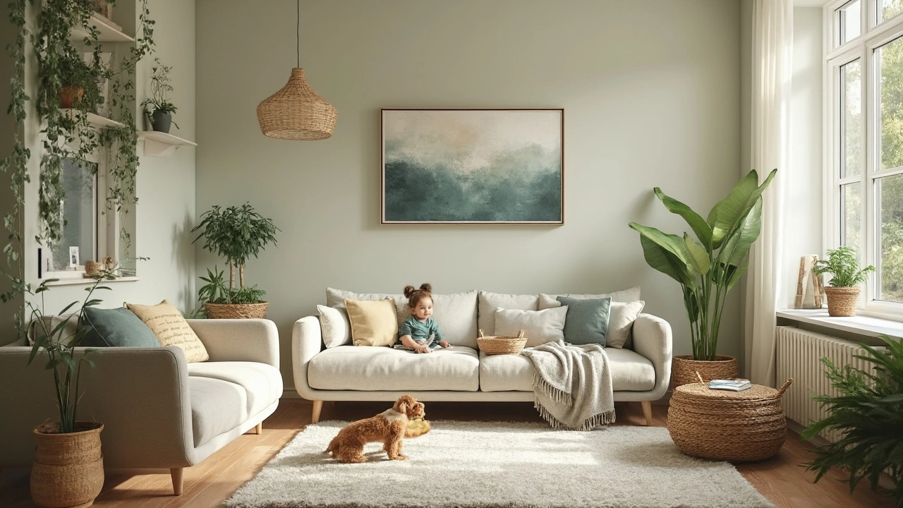
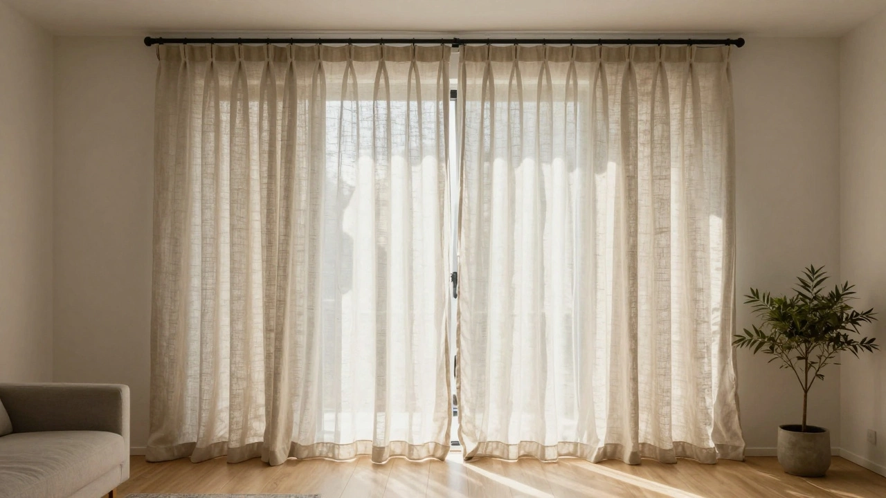
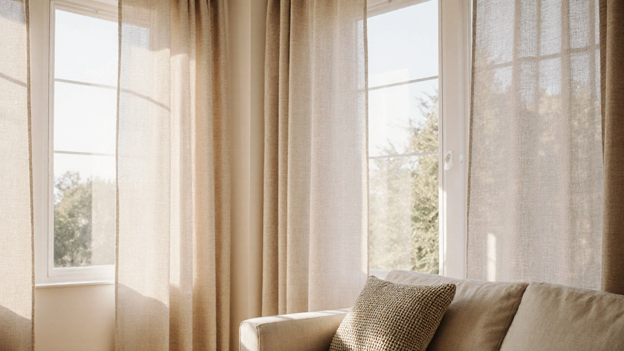
Plain curtains are quiet heroes. They don’t shout, but they don’t fade into the background either. A solid color-like warm beige, soft gray, or deep navy-acts like a neutral canvas. That’s why they’re so popular in modern homes and minimalist interiors. In a bedroom, plain curtains help you sleep better by blocking light cleanly without visual clutter. In a home office, they reduce distraction. And if you change your decor often, plain curtains make it easy. Swap out pillows, rugs, or artwork, and your windows still look intentional.
They also work well in rooms with limited natural light. A light-toned plain curtain, like oatmeal or pale cream, reflects what little sunlight comes in, making the space feel brighter. Darker solids, like charcoal or forest green, add depth without overwhelming. Unlike patterns, they don’t compete with other elements. If you have a bold sofa, patterned wallpaper, or colorful artwork, plain curtains let those features shine instead of fighting them.
Patterned curtains add personality-but they’re high-stakes
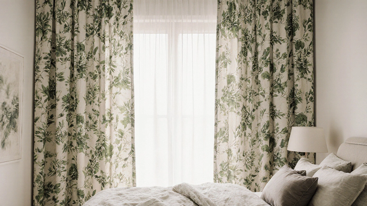
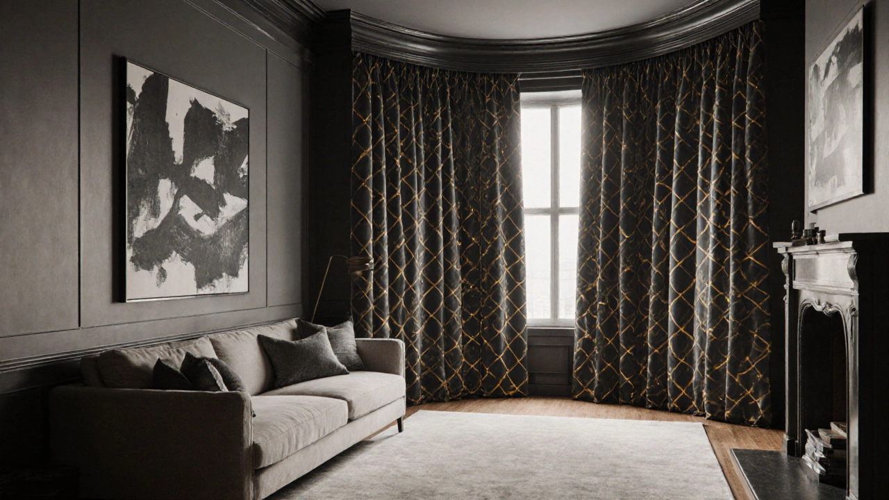
Patterned curtains are like jewelry for your windows. A stripe, a floral, a damask, or an abstract print can turn a plain room into something memorable. They work best when the pattern is intentional and balanced. Think of a living room with neutral walls and a single statement armchair. A patterned curtain here becomes the focal point, tying the whole look together.
But patterns can go wrong fast. In small rooms, busy prints make walls feel closer. A large-scale floral in a narrow bedroom can feel claustrophobic. Even in larger spaces, too many competing patterns-say, a patterned curtain with a patterned rug and a patterned sofa-creates visual noise. That’s why most designers recommend letting one pattern dominate and keeping the rest neutral.
Scale matters. Tiny prints like micro-checks or fine stripes work well in kitchens or bathrooms. Larger, bolder patterns like oversized leaves or bold geometrics suit big windows in living rooms or dining areas. And texture helps. A linen curtain with a subtle woven pattern reads as more refined than a printed polyester with a loud graphic.
Light control and privacy: what the fabric choice really affects
It’s easy to focus on looks and forget function. Both plain and patterned curtains come in different fabrics, and that changes everything. Sheer curtains, whether plain or printed, filter light softly but offer zero privacy during the day. If you need privacy, especially in a ground-floor apartment or near a busy street, you’ll need a liner or a blackout layer.
Blackout curtains are usually plain. Why? Because printing on thick, layered blackout fabric often fades unevenly or cracks over time. So if you want total darkness for a nursery or home theater, plain is your safest bet. But you can still get patterned curtains with blackout backing-just know the pattern will only show on the front side, and the back will be plain white or gray.
Thicker fabrics like velvet or cotton twill hold color and pattern better. They also drape well, which means they look more luxurious. Thin fabrics like voile or chiffon, even with patterns, tend to look cheap if not hung properly. Always test how your curtain hangs before buying. Drape it over a rod at home for a day. Does it pool nicely? Does the pattern look distorted when folded?
Match your pattern to your room’s vibe
Not every room needs drama. A bedroom should feel restful. A kitchen should feel cheerful. A home office should feel focused. Your curtain choice should support that.
In a bedroom, go for soft, repeating patterns like gentle stripes or subtle botanicals. Avoid high-contrast or chaotic prints-they keep your brain active when it should be winding down. Solid colors in calming tones like lavender, sage, or warm white are ideal.
In a kitchen or dining area, patterns can be fun. A classic gingham, a small-scale polka dot, or even a vintage-inspired tea towel print adds charm. These rooms often have bright lighting and lots of activity, so a pattern helps the space feel lively without being overwhelming.
Living rooms are the most flexible. Here, you can afford to take a risk. A large-scale abstract pattern in muted tones can elevate the whole room. But if your sofa is already patterned, or you have a bold rug, stick to plain curtains. You’re not trying to win a design award-you’re trying to create a space that feels good to live in.
What experts actually recommend
Interior designers in Melbourne and Sydney consistently say this: if you’re unsure, go plain. It’s the most forgiving choice. You can always add pattern through throw pillows, a rug, or wall art. But if you start with a loud curtain, you’re locked in. Replacing curtains is expensive and time-consuming. And if you rent, your landlord might not let you hang heavy, patterned drapes that damage the walls.
Here’s a simple rule: if your room has more than two strong visual elements (like patterned wallpaper, a bold rug, and colorful furniture), choose plain curtains. If your room is mostly neutral-white walls, wooden floors, simple furniture-then a patterned curtain can be the spark that makes it feel finished.
Also, consider the window. A large bay window with lots of glass can handle a bold pattern. A narrow window in a hallway? Keep it simple. The goal is balance, not competition.
Cost and maintenance: the hidden factors
Patterned curtains often cost more. Why? Printing fabric adds steps to production. Complex designs require more precise dyeing, alignment, and quality control. A plain curtain made from the same fabric might be 20-30% cheaper.
Maintenance matters too. Dark patterns hide dirt better than light solids. But if your pattern has fine lines or intricate details, dust and pet hair cling to them more visibly. Plain curtains, especially in neutral tones, can be vacuumed with a brush attachment and look fresh again. Patterned curtains often need professional cleaning to avoid fading or bleeding.
If you have kids, pets, or live near the coast (salt air fades colors fast), plain curtains are easier to live with. You can wash them more often without worrying about the print wearing off.
Try this: the 7-day curtain test
Before you buy, do this: hang a plain curtain in your room for a week. Use a temporary rod or even a clothesline. Live with it. Notice how the light changes at different times of day. See how it interacts with your furniture and artwork. Then, do the same with a patterned curtain-borrow one from a friend or buy a sample swatch.
After seven days, ask yourself: Do I feel calm or energized? Do I notice the curtain, or do I forget it’s there? If you forget it, that’s a good sign. The best curtains don’t demand attention-they make the room feel complete.
Final thought: It’s not about what’s trendy-it’s about what works for you
Trendy Instagram homes often show bold patterned curtains. But those are styled shots. Real life is messier. Real people need sleep, quiet, and easy cleaning. Plain curtains don’t make you look boring. They make your space feel like a sanctuary. Patterned curtains don’t make you bold-they make your room a statement.
There’s no right answer. But there is a right choice-for your space, your routine, and your peace of mind. Start with function. Then add personality. And remember: you can always change your mind next season.
Can I mix plain and patterned curtains in the same room?
Yes, but do it carefully. Use plain curtains on larger windows and patterned ones on smaller ones, like in a kitchen nook or a hallway. Or layer them: hang a sheer patterned curtain over a solid blackout liner. The key is balance-don’t let both compete for attention. Let one be the background and the other the accent.
Do patterned curtains make a room look smaller?
Large, high-contrast patterns can make a room feel tighter, especially if the walls are dark or the ceiling is low. Small, subtle patterns in light colors usually don’t have that effect. If your room feels cramped, stick to vertical stripes or soft, faded prints. They draw the eye upward, creating the illusion of height.
Are plain curtains boring?
Not if you choose the right color and texture. A deep emerald velvet plain curtain looks luxurious. A linen curtain in oatmeal has natural texture that changes with the light. Plain doesn’t mean flat-it means intentional. The beauty is in the details: how it drapes, how the fabric catches the sun, how it frames the window without distracting.
Should I match my curtains to my walls or my furniture?
Neither. Match them to the mood you want. If your walls are white and your furniture is neutral, a curtain in a soft blue or warm gray ties the room together. If your sofa is a bold red, a plain cream curtain gives your eyes a rest. The goal isn’t to match-it’s to harmonize. Think in tones, not exact colors.
What’s the best fabric for plain curtains in a sunny room?
Linens and cotton blends are ideal. They breathe well, block some UV rays, and fade slowly. Avoid polyester if you’re in a place like Melbourne with strong summer sun-it can yellow over time. Look for curtains labeled as UV-resistant or sun-blocking. A medium-weight fabric with a tight weave holds up best.