2025 Wallpaper Trend Matcher
Select a room type and lighting condition to discover which 2025 wallpaper trend suits your space best.
Recommended Trend
Why this works:
Walking into a room in mid-2025 felt different. It wasn't just about furniture or layout; it was about the walls. After years of safe neutrals and cool grays, the world finally exhaled and embraced color with a vengeance. If you are looking back at what defined wallpaper color trends for 2025, you are looking at a year that balanced deep comfort with electric optimism.
We didn't just pick colors from a chart. We picked them based on how we lived. The post-pandemic need for sanctuary evolved into a desire for connection and vitality. Walls became canvases for mood regulation. Here is exactly what happened to our walls in 2025, broken down by the shades that dominated showrooms, Instagram feeds, and actual living rooms.
The Rise of "Warm Earth" Tones
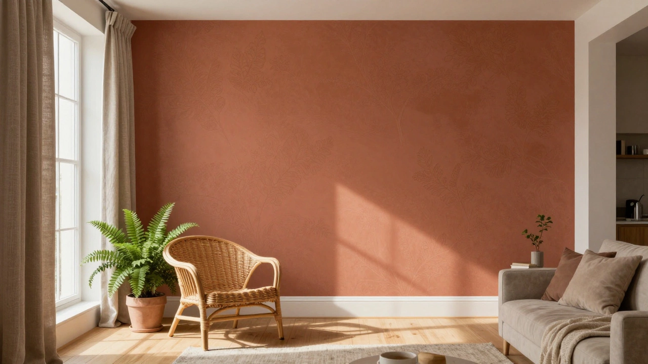
If there was one dominant theme in 2025, it was warmth. But not the beige warmth of the early 2010s. This was richer, deeper, and more complex. Think clay, terracotta, and burnt sienna. These colors grounded spaces. They made modern apartments feel like caves-safe, enclosed, and cozy.
Designers moved away from flat white walls because they felt too sterile. Instead, they reached for wallpapers with subtle textures in these earth tones. A popular choice was a matte-finish wallpaper in a shade called "Desert Rose." It worked beautifully with natural wood flooring and linen curtains. You saw this everywhere, from Melbourne cafes to New York lofts. It wasn't loud, but it had presence.
Why did this happen? Because people spent more time at home, but they also wanted their homes to feel connected to nature. Biophilic design wasn't just about plants anymore; it was about bringing the outside in through color. Clay-colored walls mimicked soil and stone, creating a subconscious sense of stability.
- Key Shades: Terracotta, Burnt Orange, Deep Clay, Rust.
- Best For: Living rooms, bedrooms, and dining areas where relaxation is key.
- Pair With: Natural wood, rattan, and greenery.
Deep Jewel Tones for Drama
While earth tones provided comfort, jewel tones provided drama. In 2025, dark colors stopped being scary. Homeowners realized that a dark wall doesn't make a room smaller if you light it right. Emerald green, sapphire blue, and amethyst purple became the new black.
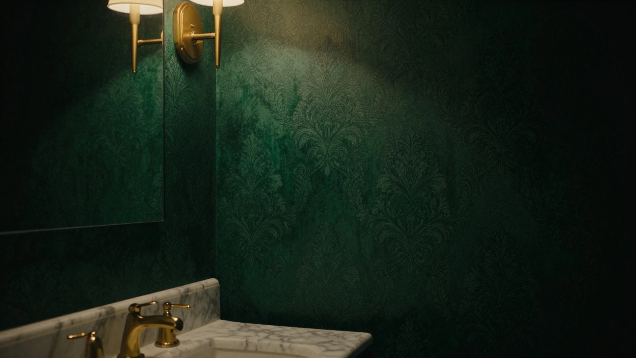
This trend was huge in accent walls. Imagine a bathroom with emerald green wallpaper featuring a subtle damask pattern. Or a hallway lined with deep navy blue paper that has a slight metallic sheen. These colors absorbed light rather than reflecting it, which created a moody, intimate atmosphere. It was perfect for reading nooks, powder rooms, and master bedrooms.
The shift here was psychological. Light colors felt too clinical after years of video calls and bright screens. Darker colors offered a visual break. They signaled to your brain that it was time to slow down. Wallpaper manufacturers responded by releasing collections focused on depth and richness. Brands like Sanderson and Farrow & Ball saw sales spike in their darkest hues.
| Color Family | Psychological Effect | Best Room Type | Lighting Needs |
|---|---|---|---|
| Warm Earth | Grounding, Calm | Living Room | Natural Light |
| Jewel Tones | Dramatic, Intimate | Bedroom/Bathroom | Artificial/Ambient |
| Electric Pastels | Energetic, Playful | Kids' Room/Office | Bright/Cool |
| Muted Neutrals | Serene, Clean | Open Plan Areas | Any |
Electric Pastels and Digital Hues
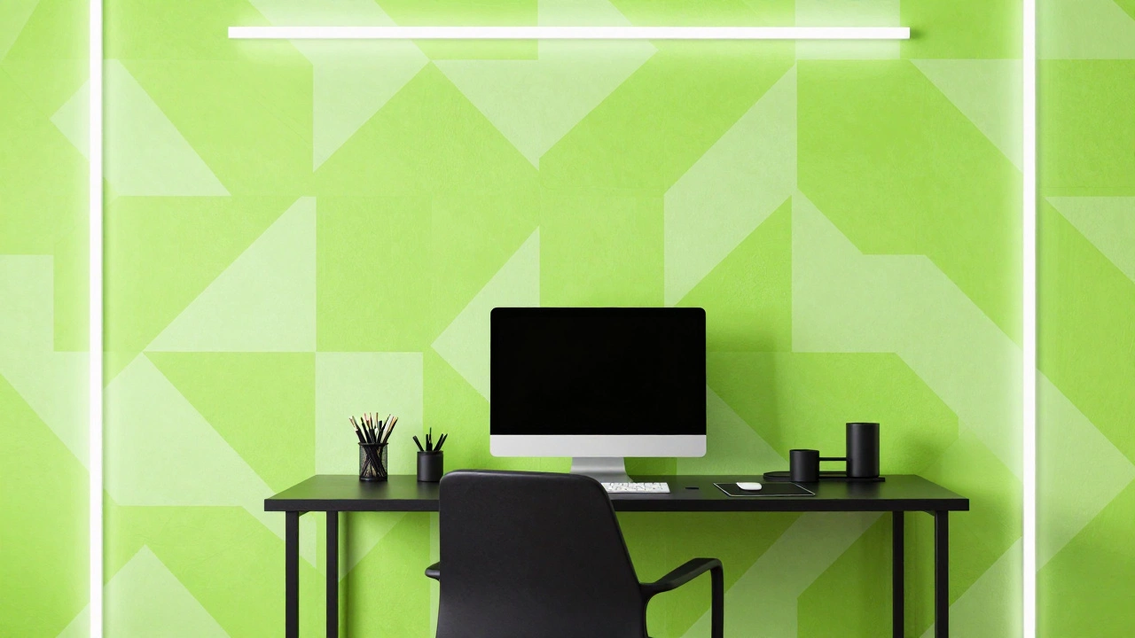
Not everyone wanted darkness. A counter-trend emerged in 2025 called "Digital Pastels." These were bright, almost neon-like pastels that looked like they came straight out of a video game or a social media filter. Think electric lime, hot pink, and cyber blue.
This trend was driven by Gen Z and younger Millennials who grew up with digital aesthetics. They rejected the muted palettes of their parents. Instead, they chose wallpapers with bold geometric patterns in these vibrant colors. It was playful, energetic, and unapologetically loud.
You saw this in home offices and creative studios. A wall painted or papered in electric lime boosted energy levels. It combated the fatigue of remote work. While older generations found it jarring, younger homeowners loved the boost of dopamine it provided. It was a clear signal that interior design was becoming more personalized and less rule-bound.
The Return of Muted Neutrals (But Better)
Let's be honest. Not every room can handle emerald green or electric pink. In 2025, neutrals made a comeback, but they were warmer and softer than before. Greige (gray-beige) was replaced by "Warm White" and "Oatmeal."
These colors weren't boring. They were sophisticated. The trick was texture. Plain white walls felt cheap. Textured wallpapers in oatmeal or cream added depth without adding color. Grasscloth wallpapers and linen-finish papers became best-sellers. They reflected light softly, making small spaces feel larger and airier.
This trend appealed to minimalists and renters who wanted a clean slate. It was also practical. Neutral wallpapers hid minor scuffs better than dark colors and were easier to match with changing furniture. If you planned to sell your home soon, these were the safest bets. They appealed to the broadest audience.
How to Choose the Right Trend for Your Home
Knowing the trends is one thing. Applying them is another. Here is how to decide which 2025 color trend fits your space.
- Assess Your Light: North-facing rooms benefit from warm earth tones to add heat. South-facing rooms can handle cool jewel tones because they already have plenty of light.
- Consider the Room's Function: Use calming neutrals or earth tones in bedrooms. Use energizing pastels or dramatic jewel tones in entertainment areas.
- Test Samples: Never buy wallpaper based on a screen. Print a large sample and tape it to your wall. Watch how it changes from morning to night.
- Think Long-Term: Electric pastels are fun but might date quickly. Earth tones and jewel tones have timeless appeal. If you love a trend, use it in accessories first.
Common Mistakes to Avoid
Even with great trends, mistakes happen. Here is what tripped people up in 2025.
Ignoring Undertones: Many buyers thought a gray wallpaper was neutral. In warm lighting, it turned pink or purple. Always check undertones. A "cool" gray needs cool lighting to look good. A "warm" gray needs warm lighting.
Overpowering Small Spaces: Large-scale patterns in deep jewel tones can crush a small bathroom. Stick to small-scale patterns or solid colors in tight spaces.
Forgetting Texture: Flat colors can look dull. Adding texture through wallpaper material (like vinyl or fabric) adds interest even if the color is simple.
What was the most popular wallpaper color in 2025?
Terracotta and warm clay tones were arguably the most popular. They offered a balance of warmth and sophistication that fit both modern and traditional homes. However, deep emerald green was a close second for accent walls.
Are dark wallpaper colors still in style?
Yes, very much so. In 2025, dark jewel tones like navy, emerald, and burgundy were highly fashionable. They create intimacy and drama, especially when paired with good lighting and metallic accents.
Should I follow color trends for my whole house?
No. Trends change fast. Use trending colors in high-impact areas like an entryway or a guest room. Keep main living areas in timeless neutrals or earth tones that you won't tire of in five years.
What lighting works best with 2025 wallpaper trends?
Warm white lighting (2700K-3000K) enhances earth tones and jewel tones. Cool white lighting (4000K+) makes electric pastels pop. Avoid fluorescent lighting as it washes out rich colors.
Is textured wallpaper better than flat wallpaper?
Texture adds depth and hides imperfections. In 2025, textured wallpapers in neutral colors were preferred over flat paints because they added architectural interest without needing bold colors.