Curtain Length Calculator
Get Perfect Curtain Measurements
Calculate the ideal curtain length and rod extension based on article guidelines for a high-end look.
Your Results
Enter your measurements to see results
According to article guidelines:
- Mount rod 4-6 inches below ceiling
- Extend rod 6-12 inches beyond window
- Curtains should kiss floor with minimal pooling
Most people think classy curtains mean expensive fabric or designer brands. But the truth? It’s not about the price tag-it’s about the details. A $20 pair of curtains can look more luxurious than a $500 set if they’re hung, layered, and finished right. The difference between ordinary and elegant comes down to just a few smart choices.
Hang Them Higher Than You Think
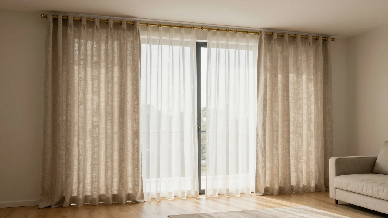
One of the biggest mistakes people make is hanging curtains at the top of the window frame. That makes the ceiling feel lower and the room smaller. Instead, mount the rod as close to the ceiling as you can-ideally within 4 to 6 inches below it. Even if your window is small, this trick makes the room feel taller and more spacious.
Don’t just stop at height. Extend the rod 6 to 12 inches beyond each side of the window. This lets light flow in fully when the curtains are open, and creates a wider, more balanced look when they’re closed. You’re not just hanging fabric-you’re framing the entire wall.
Choose the Right Length
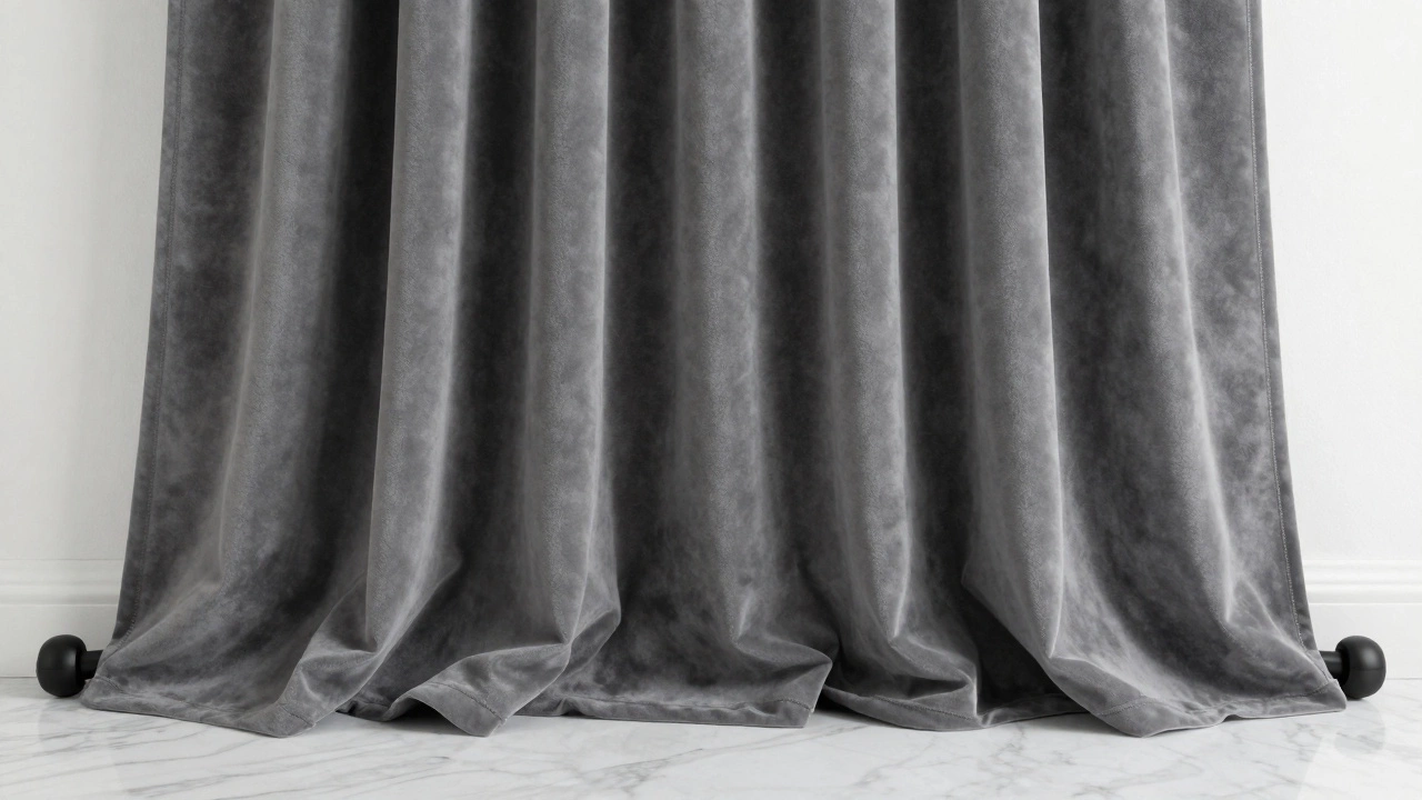
Classy curtains always touch the floor. Not hover above it. Not puddle like a Shakespearean drama. Just kiss the floor.
For a clean, modern look, let the fabric end exactly at the floor-no more, no less. If you want a little drama, allow 1 to 2 inches of gentle pooling. Anything more than that looks messy and cheap. Avoid the temptation to buy curtains that are too long and hem them yourself. It’s better to order custom lengths or pick a standard size that fits your ceiling-to-floor height exactly.
Measure from the rod down to the floor, then add 1 inch for pooling. That’s your ideal curtain length. Skip the ‘floor-length’ labels on store tags-they’re often inaccurate. Always measure twice.
Invest in Quality Hardware
The rod and rings matter more than you think. A thin, flimsy metal rod with plastic brackets screams budget. A sturdy, matte black or brushed brass rod with metal rings says luxury.
Go for rods with a diameter of at least 1.5 inches. Thicker rods hold heavier fabrics better and look more substantial. Avoid plastic or hollow metal ends-they’re cheap-looking and won’t last. Look for rods with end caps that match the finish. If you pick a bronze rod, make sure the finials are bronze too.
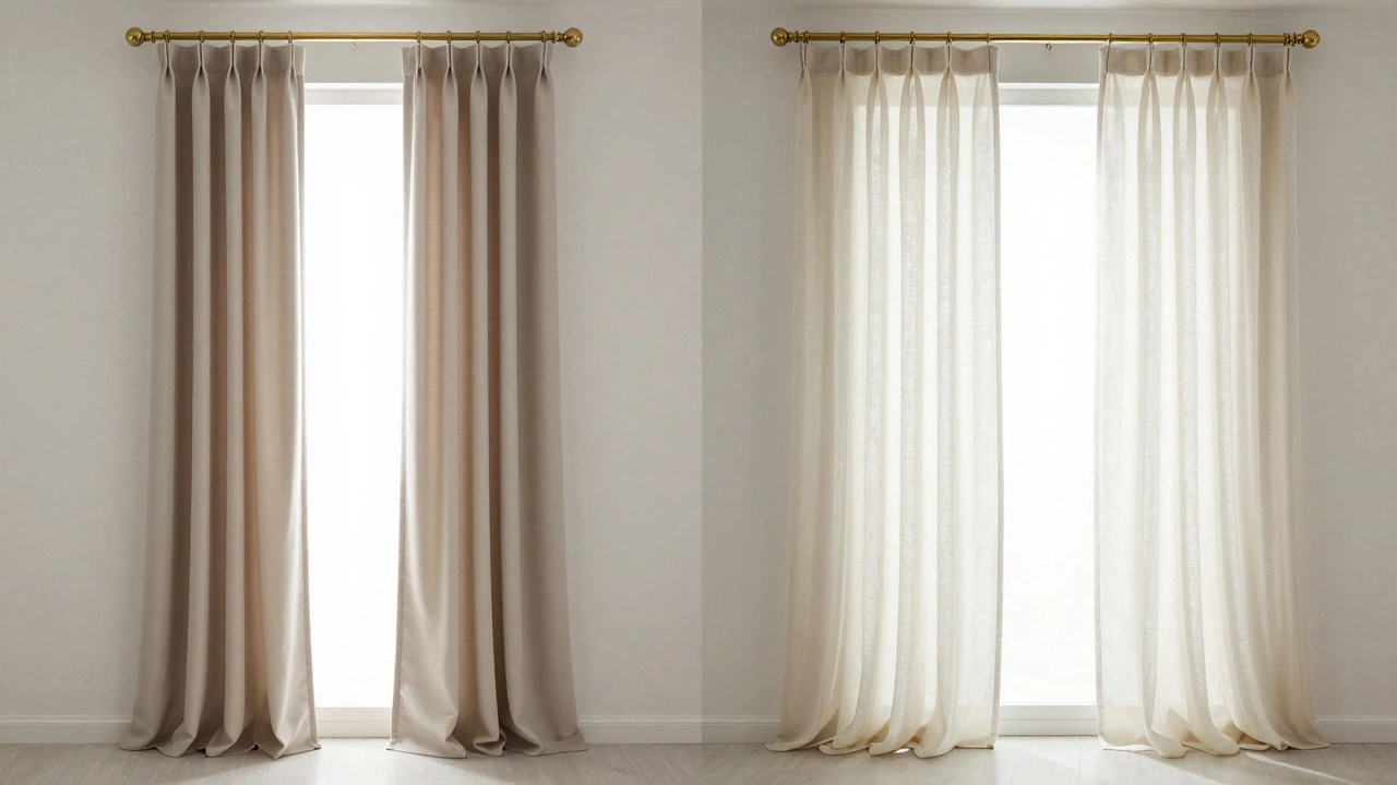
For the rings, choose ones that glide smoothly. Clip-on rings work fine for lightweight sheers, but for heavier drapes, go with sewn-in tabs or grommets. Grommets create clean, even folds and look polished. Tabs give a softer, more traditional feel. Pick one and stick with it across all windows in the room for consistency.
Layer with Sheers
A single panel of heavy velvet might look rich, but it’s not fully classy without a layer underneath. Sheer curtains-like linen, cotton voile, or lightweight silk-add depth and soften the light.
Use a separate rod mounted slightly in front of the main curtain rod. Hang the sheers so they sit just behind the heavier drapes. When the main curtains are closed, the sheers still let in a soft glow. When open, they create a layered, airy effect that feels intentional, not accidental.
Don’t go overboard with patterns. Solid sheers work best. A subtle texture-like a slight weave or ribbing-is fine. Avoid floral or bold prints. They compete with the main curtains and ruin the calm, refined vibe.
Use the Right Fabric
Not all heavy fabrics are created equal. Velvet, bouclé, and linen blends look expensive because they have texture and weight. Polyester blends that shimmer under artificial light? They look like a hotel room from 1998.
Look for natural fibers or blends with at least 60% cotton, linen, or wool. These breathe better, drape more naturally, and age gracefully. Avoid anything labeled ‘wrinkle-free’ unless it’s blended with a high percentage of natural fiber-those treatments often make fabric stiff and plastic-like.
For color, stick to neutral tones: cream, taupe, charcoal, deep olive, or soft gray. These work with any style and don’t date quickly. If you want color, pick one that’s already in the room-like the sofa or an accent pillow. That way, the curtains feel like part of the design, not an afterthought.
Don’t Forget the Trim
Classy curtains often have a small, thoughtful detail at the bottom. A simple hem with a narrow trim-like a thin cord, metallic thread, or contrasting bias tape-adds polish.
Some people add fringe, but only if the rest of the room has a touch of vintage or boho charm. Otherwise, skip it. A clean, straight hem with a 1-inch folded edge is timeless. If you’re sewing yourself, double-fold the hem and stitch close to the edge. No loose threads. No uneven hems.
For a high-end touch, consider lining. A blackout or thermal lining doesn’t just block light-it adds structure. It makes the fabric hang straighter, reduces wrinkling, and gives the curtains more body. You won’t see the lining, but you’ll feel the difference.
Keep It Simple
Over-decorating curtains kills elegance. No tassels. No tiebacks made of rope and seashells. No fringe on both sides. No seven different patterns stacked together.
One fabric. One layer. One rod. One clean line. That’s the formula. If you’re tempted to add more, step back. Ask yourself: does this make the room feel calmer or noisier? If it’s the latter, take it out.
Even the best curtains can look cheap if the room around them is cluttered. Keep the windowsill clear. No stacks of books, no plastic plants, no mismatched coasters. Let the curtains be the star.
Real Examples That Work
In a Melbourne apartment with high ceilings and large windows, a homeowner used floor-to-ceiling linen curtains in a warm oatmeal color. The rod was mounted nearly to the ceiling, extended 10 inches past the frame, and paired with brushed brass grommets. Sheers in the same tone hung behind. No tiebacks. No trim. Just clean lines and natural light. The result? A space that felt like a luxury boutique hotel.
Another example: a modern townhouse with narrow windows. Instead of trying to make them look bigger, they kept the curtains simple-mid-length (just above the windowsill) in a soft charcoal wool. The rod was matte black, mounted just above the window frame. They didn’t try to stretch the space-they embraced its shape. And it looked intentional, not compromised.
What Not to Do
Don’t buy curtains that are too short. Even 2 inches above the floor looks unfinished.
Don’t use the same rod for sheers and drapes unless they’re on separate tracks. It looks cluttered.
Don’t match curtains exactly to your walls. It blends them in too much. They should stand out slightly-not as a focal point, but as a refined accent.
Don’t ignore the back of the curtains. If they’re visible from outside (like in a front room), make sure the lining or backing is neat. A messy backside ruins the illusion.
Final Tip: Let Them Breathe
Classy curtains aren’t meant to be pulled tight every day. Leave them open during daylight. Let the sun hit the fabric. That’s when texture and quality really show. The way light moves through linen, the way velvet catches the afternoon glow-those are the moments that make a room feel expensive.
It’s not about how much you spend. It’s about how carefully you choose, hang, and live with them.
Can I make cheap curtains look classy?
Yes. The fabric matters less than how you hang it. Mount the rod high and wide, use quality grommets or tabs, add a lining, and make sure the length hits the floor. Even budget curtains can look expensive with the right treatment.
Should curtains match the walls or the furniture?
Neither. Curtains should complement both. Pick a color that’s in the room-like a shade from your sofa, rug, or artwork-but go one tone lighter or darker. This creates harmony without blending in too much.
Are blackout curtains classy?
Absolutely-if they’re well-made. Look for blackout curtains with a woven, textured face fabric (like linen or cotton) and a high-quality lining. Avoid plastic-backed blackout panels-they look and feel cheap. The right ones block light without looking like a hotel room from the 80s.
How do I choose between grommets and tabs?
Grommets give a modern, crisp look and glide easily. Tabs are softer and more traditional, with a slightly relaxed drape. Choose grommets for contemporary spaces, tabs for classic or cozy rooms. Just pick one style and stick with it across all windows.
Do I need sheers with my curtains?
Not always, but they help. Sheers add depth, soften light, and make the space feel more layered. If you want a minimalist look, skip them. But if you want that calm, high-end feel, sheers are one of the easiest upgrades.