Wealth Colors: How Rich Hues Instantly Elevate Your Space
Ever walked into a room and felt the vibe scream "luxury" without a single gold statue? Chances are the walls are dressed in what designers call wealth colors — deep, saturated shades that make a space feel important. You don’t need a massive budget or a fancy painter to get that effect. Let’s break down what wealth colors are, why they work, and how you can use them today.
What Makes a Color a "Wealth" Color?
Wealth colors aren’t a secret code; they’re simply hues that have historically been linked to wealth and power. Think rich navy, emerald green, burgundy, charcoal, and deep teal. These shades absorb more light, creating a cozy, intimate atmosphere that feels more exclusive than a bright white.
Why do they work? Darker pigments tend to hide imperfections on walls and make furniture stand out. They also make a room feel smaller in a good way – like a private lounge rather than an open hall. Pair them with the right accents and you get a sophisticated look without trying too hard.
How to Use Wealth Colors in Every Room
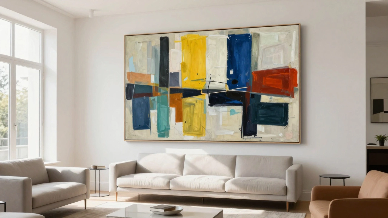
Living rooms: Paint one wall in a deep navy or charcoal and keep the others neutral. Add brass lamps or gold‑tone frames for contrast. A velvet sofa in a muted tone will pop against the dark backdrop.
Bedrooms: Emerald or deep plum works wonders on the headboard wall. Keep bedding light and airy – white linen or soft grey will balance the richness.
Kitchens: Dark teal cabinets paired with brushed steel handles feel modern and upscale. If you’re hesitant about full‑on dark, try a charcoal island and keep the rest of the cabinets lighter.
Bathrooms: A subtle burgundy tile strip or a deep‑hued vanity paint can add that luxurious spa feel. Pair with polished chrome fixtures for a clean finish.
When you’re unsure, start small. Paint a single accent wall, a cabinet, or even a piece of furniture. Test the color with natural light at different times of day – what looks flat in the morning may glow in the evening.
Remember, the key is balance. Too much dark can make a room feel gloomy. Use lighter trims, reflective surfaces, and plenty of texture – think silk cushions, wooden floors, or a patterned rug – to keep the space lively.
Finally, don’t forget the power of finish. Matte paints absorb light and feel plush, while satin or low‑gloss adds a subtle sheen that catches the eye without being shiny. Both work well with wealth colors, but matte gives a softer, more intimate vibe.
Ready to give your home a richer feel? Pick one of the classic wealth shades, start with an accent wall, and layer in complementary textures. You’ll be surprised how quickly a simple color change can turn an ordinary room into a statement space.