Bathroom Color & Lighting Simulator
Walk into a bathroom that feels like a high-end spa, and you’ll notice one thing immediately: the walls aren’t screaming for attention. They’re whispering. The difference between a space that stresses you out and one that melts your shoulders down usually comes down to a single decision-the color on your walls. But what is the most relaxing color for a bathroom? It’s not just about picking blue because it reminds you of the ocean. It’s about understanding how light, texture, and psychology interact in a small, tiled room.
The Psychology of Calm: Why Neutrals Win
We often think of "relaxing" as a specific hue, like seafoam green or lavender. While those can work, they are risky. If the lighting is wrong, lavender turns purple; if the tile grout is dirty, seafoam looks dingy. The safest, most consistently relaxing palette relies on neutrals with a warm undertone. Think of these colors as the background noise of a meditation track-they are there, but they don’t distract you.
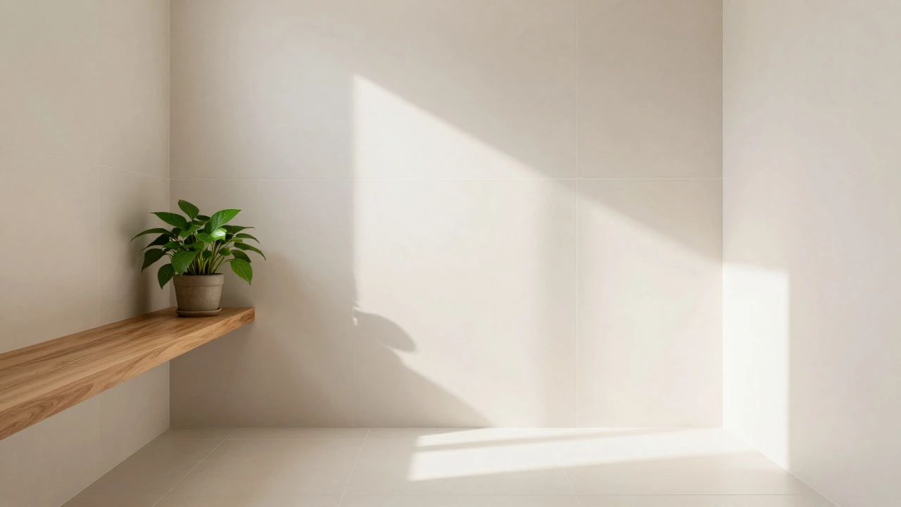
Warm White is a versatile base color that reflects natural light and creates an airy, spacious feel without the clinical coldness of pure white. Unlike stark white, which can make a bathroom feel like a hospital operating theater, warm whites have hints of beige, cream, or yellow. This subtle warmth mimics sunlight, triggering a sense of safety and comfort. Brands like Sherwin-Williams (with their "Alabaster") or Benjamin Moore (with "Chantilly Lace") offer variations that lean warmer, avoiding the sterile look.
Why does this work? Because bathrooms are functional spaces. You brush your teeth, you shower, you get ready. High-contrast colors or dark tones can subconsciously raise your heart rate by creating visual clutter. A soft, warm neutral allows your eyes to rest. It provides a blank canvas that lets other elements-like wood accents or plants-shine without competing for dominance.
The Power of Soft Blues and Greens
If you want more personality than white but still crave tranquility, look to nature. Blue and green are biophilic colors, meaning they connect us to the natural world. Our brains are wired to find these hues soothing because they signal water and foliage-two things essential for survival and relaxation.
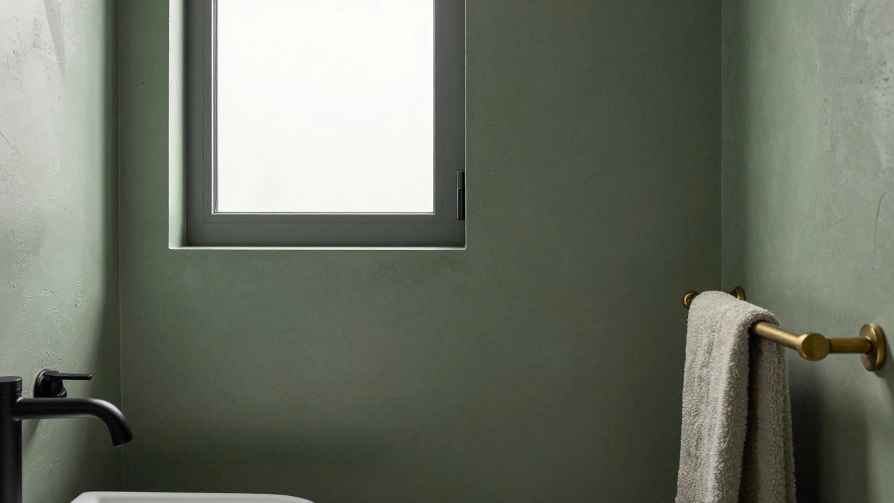
Sage Green is a muted, earthy green that evokes the feeling of a forest floor or dried herbs, offering a grounded and serene aesthetic. Sage has become a favorite in modern bathroom design because it pairs beautifully with both matte black fixtures and brass hardware. It’s less formal than emerald and less playful than lime. In a Melbourne home, where we might have limited natural light in some rooms, sage can add depth without closing the space in, provided you keep the ceiling and trim lighter.
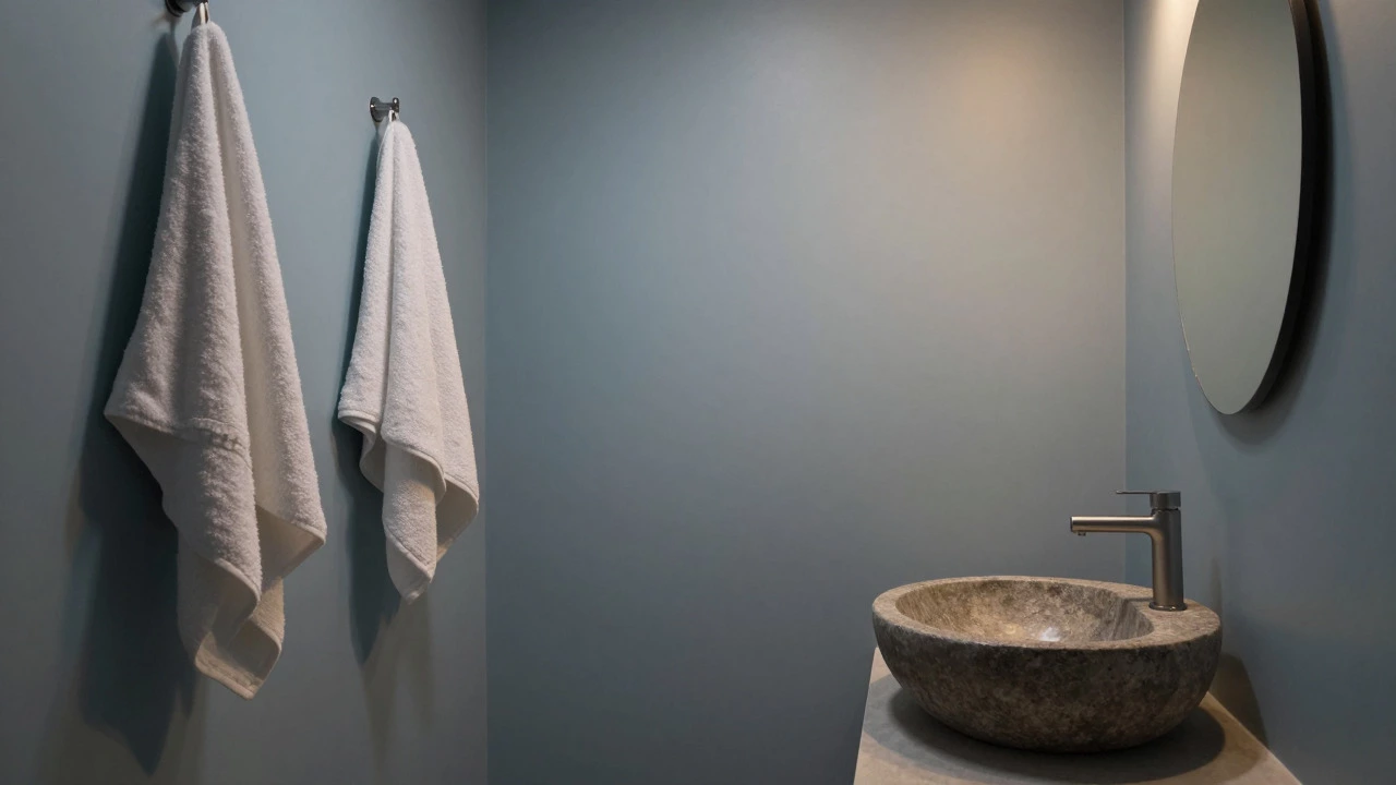
Soft blues, particularly sky blue or powder blue, mimic clear water. However, be careful with saturation. Bright cobalt blue is energizing, not relaxing. You want desaturated blues-colors that look like they’ve been mixed with gray. These "greige" blues (gray + beige) or "slate" blues provide a cool, calming effect that lowers blood pressure slightly, according to color psychology studies. They work exceptionally well in bathrooms with white subway tiles, creating a crisp, clean look that feels refreshing after a long day.
Lighting: The Hidden Variable in Color Choice
You can pick the perfect relaxing color, but if your lighting is wrong, it will fail. Bathrooms are notorious for poor lighting-often dominated by harsh overhead vanity lights that cast shadows under your eyes. This interacts directly with wall color.
- Natural Light: North-facing bathrooms (common in many older homes) receive cooler, indirect light. Here, warm whites and yellows prevent the room from feeling chilly. South-facing bathrooms get bright, direct sun, so cooler tones like soft blue or gray won’t feel too cold.
- Artificial Light: Most bathroom bulbs are either cool white (bluish) or warm white (yellowish). Cool white bulbs will make a beige wall look gray and dull. Warm white bulbs (2700K-3000K) enhance the cozy feel of creams and sages. Always test your paint sample under the actual light bulb you plan to use, not just daylight.
A pro tip: Use dimmers. Even the most relaxing color can feel oppressive if the light is blindingly bright. A dimmer switch allows you to lower the intensity in the evening, transforming the bathroom from a morning utility room into a nighttime sanctuary. The interplay between low light and soft colors is where true relaxation happens.
Texture Over Flat Paint: Adding Depth
Color isn’t just about pigment; it’s about surface. A flat, glossy white wall can feel slippery and cold. To enhance the relaxing vibe, introduce texture. Textured surfaces diffuse light, softening the appearance of the color and adding tactile interest.
| Surface Type | Visual Effect | Best For |
|---|---|---|
| Glossy Tile | Reflects light, makes colors appear brighter and cooler | Small bathrooms needing expansion |
| Matte Paint | Absorbs light, softens edges, hides imperfections | Creating a cozy, intimate atmosphere |
| Textured Plaster/Venice Plaster | Adds shadow and depth, making neutral colors richer | Spa-like, high-end finishes |
| Wood Paneling | Warms up any color palette, adds organic grain | Accent walls behind vanities |
Consider using a matte finish for your walls. Matte paints absorb light rather than reflecting it sharply, which reduces glare and creates a softer visual environment. If you’re tiling, choose large-format tiles with minimal grout lines. Too much grout creates a grid pattern that can feel busy and stressful. Large, smooth surfaces promote a sense of calm continuity.
Complementary Elements: Beyond the Walls
Your wall color sets the stage, but the props matter too. To maximize relaxation, ensure your accessories complement the chosen hue. If you’ve gone with sage green, avoid red towels or orange rugs. Stick to analogous colors-shades next to each other on the color wheel-or neutrals like white, cream, and taupe.
Incorporate natural materials. Wood, stone, and linen all carry inherent textures that soften the hard edges of bathroom fixtures. A wooden shelf against a soft blue wall adds warmth. A stone vessel sink against a warm white backdrop adds grounding weight. These elements work together to create a holistic sensory experience. The goal is harmony, not contrast.
Don’t forget plants. Live greenery introduces a living element that changes slightly over time, keeping the space dynamic yet peaceful. Even a single pothos plant in a corner can break up the monotony of a neutral wall and reinforce the connection to nature that colors like sage and sky blue evoke.
Common Mistakes to Avoid
Even with the best intentions, people often sabotage their relaxing bathroom designs. Here are three pitfalls to watch out for:
- Ignoring Undertones: Mixing cool and warm undertones creates visual vibration. If your cabinets are oak (warm), don’t pair them with a cool gray wall unless you bridge the gap with warm metal fixtures. Clashing undertones cause subconscious stress.
- Going Too Dark: While dark moody bathrooms are trendy, they require excellent lighting and maintenance to avoid feeling cave-like. For relaxation, lighter values reflect more light and feel more open. If you love dark colors, use them on an accent wall or cabinetry, not the entire room.
- Overcomplicating the Palette: More than three main colors in a small space creates chaos. Stick to a dominant color (walls), a secondary color (cabinets/floor), and an accent color (towels/accessories). Simplicity is key to calm.
Remember, relaxation is subjective. What calms one person might bore another. The most important step is to live with the color before committing. Buy small samples, paint swatches on different walls, and observe them at different times of day. Does the wall look inviting in the morning rush? Does it feel serene under the nightlight? Trust your eyes and your gut.
Is white really the most relaxing color for a bathroom?
Pure white can be too stark and clinical. Warm whites, creams, and off-whites are far more relaxing because they mimic natural sunlight and feel softer to the eye. They provide a clean, airy feel without the stress of high contrast.
What color should I avoid in a relaxing bathroom?
Avoid bright, saturated colors like red, orange, or electric blue. These are energizing and can increase anxiety. Also, avoid mixing clashing undertones (e.g., cool gray walls with warm yellow lighting) as this creates visual discomfort.
Does lighting affect how relaxing a bathroom color looks?
Yes, significantly. Cool white bulbs can make warm colors look dull and gray, while warm bulbs enhance cozy tones. Natural light direction also matters; north-facing rooms need warmer colors to counteract cool light, while south-facing rooms can handle cooler hues.
Can I use dark colors for a relaxing bathroom?
Dark colors can be relaxing if used sparingly, such as on an accent wall or cabinetry. However, painting all four walls dark can make a small bathroom feel cramped and cave-like, which may induce stress rather than calm. Ensure you have ample, layered lighting if you go dark.
How do I test a paint color before committing?
Buy small sample pots and paint large swatches (at least 1x1 foot) on different walls. Observe the color at different times of day-morning, noon, and night-and under both natural and artificial light. This helps you see how the undertones shift and whether the color truly feels relaxing in your specific space.