Room Expander Visualizer
Quick Wins for a Spacious Feel
- Go Light: Stick to whites, creams, and pale grays to reflect light.
- Match the Walls: Choose curtains in a shade similar to your paint to erase visual boundaries.
- Avoid Heavy Fabrics: Swap thick velvet for sheer linens or voiles.
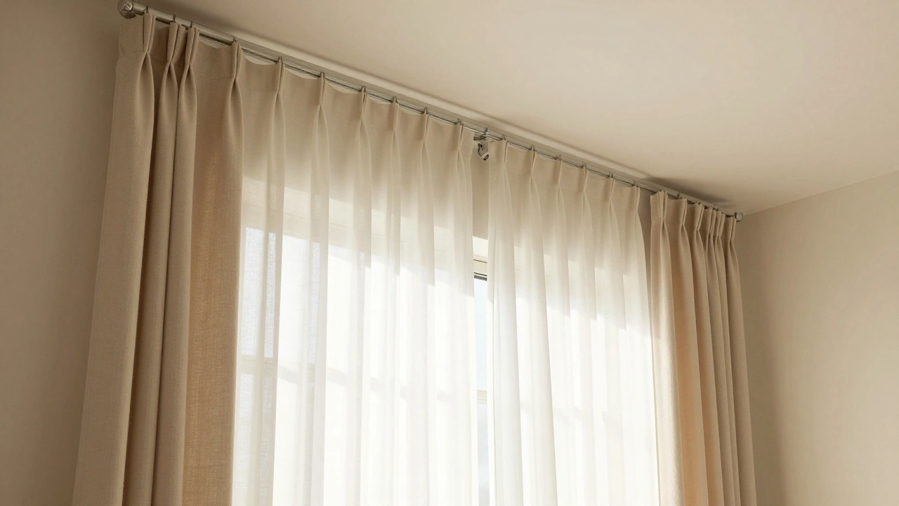
- Hang High: Place your rod closer to the ceiling than the window frame.
The Power of Light Colors
When you use curtain colors for small rooms that are light and airy, you are essentially using a mirror effect. Dark colors absorb light, which creates a "stop" sign for your eyes. When your gaze hits a dark curtain, it perceives a hard boundary, making the room feel like it ends right there.
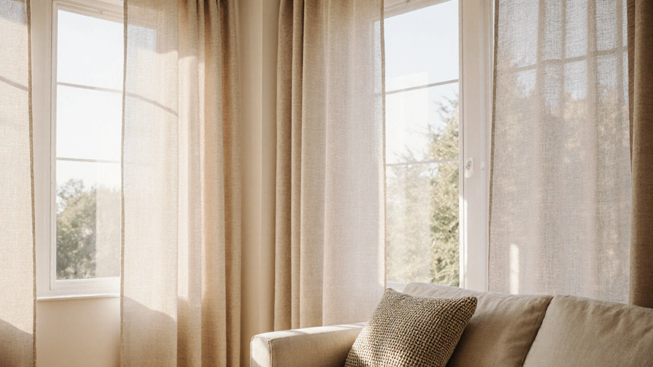
On the flip side, White is the gold standard for expanding a space. Because it reflects the maximum amount of visible light, it blurs the line between the wall and the window. If white feels too clinical, try Off-White or Cream. These warmer tones still provide that expansive feel but make the room feel lived-in rather than like a gallery. Imagine a small bedroom with a pale beige wall; if you hang cream curtains, the eye glides across the surface without interruption, which makes the room feel a few inches wider than it actually is.
Using Monochrome Magic
One of the biggest mistakes people make is choosing a high-contrast color for their window treatments. For example, putting navy blue curtains against a light gray wall creates a sharp vertical line. This line acts as a visual anchor that tells your brain, "The wall stops here." To make a room feel bigger, you want to eliminate these anchors.
Try a monochromatic approach. This means picking a curtain color that is just one or two shades lighter or darker than your wall paint. When the Color Palette is seamless, the window treatment blends into the architecture. This trick is widely used in Minimalism, where the goal is to reduce visual noise. When there is less for the eye to process, the space feels less cluttered and naturally more open.
| Color Group | Visual Effect | Best Use Case |
|---|---|---|
| Pure White / Ivory | Maximum light reflection; opens space | Tiny studios, dark basements |
| Pale Gray / Sage | Soft transition; calming effect | Modern living rooms, home offices |
| Beige / Champagne | Warmth without closing in | Cozy bedrooms, dining areas |
| Deep Blue / Charcoal | Adds depth but shrinks the perimeter | Large rooms needing more intimacy |
Fabric Choice: More Than Just Color
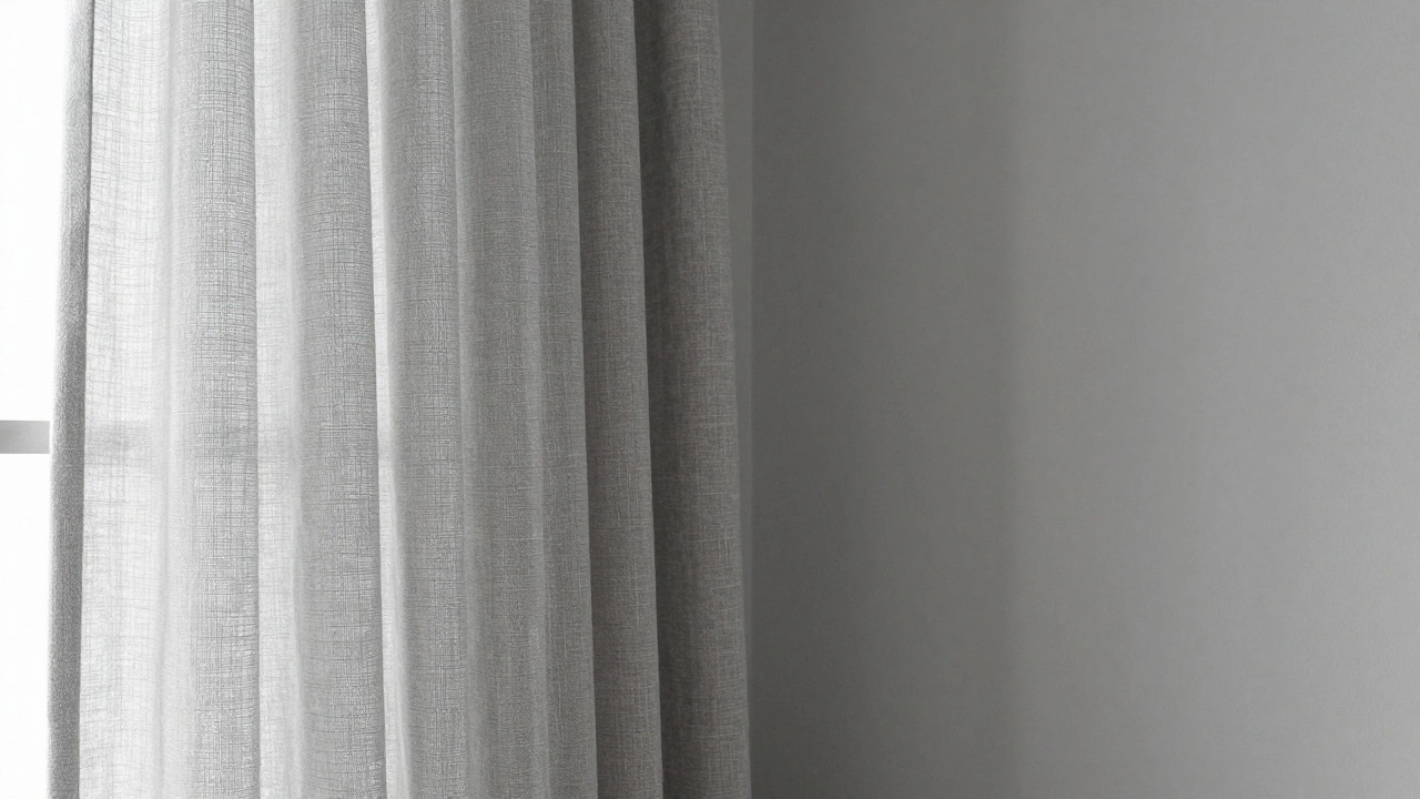
You can pick the perfect shade of white, but if the fabric is a heavy, light-blocking Blackout Curtain, you might still feel cramped. Texture and transparency play a huge role in the psychology of space. Heavy fabrics create a sense of weight and enclosure.
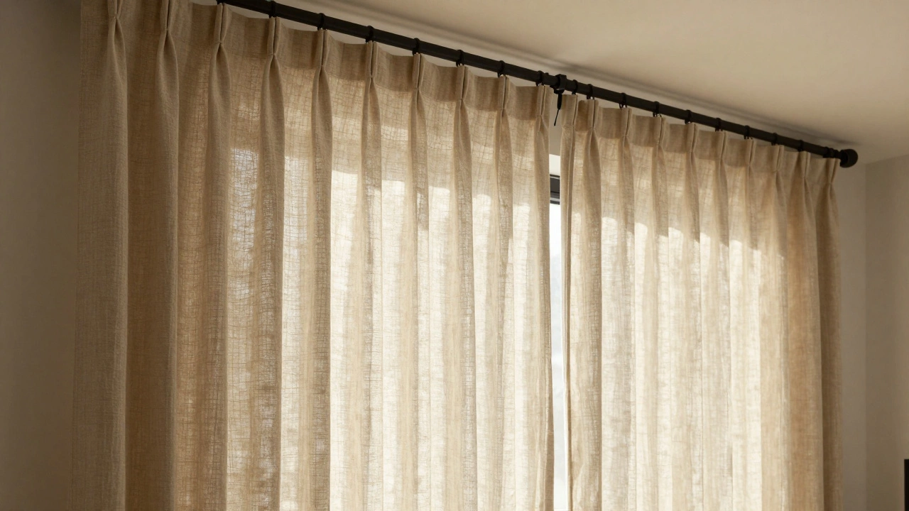
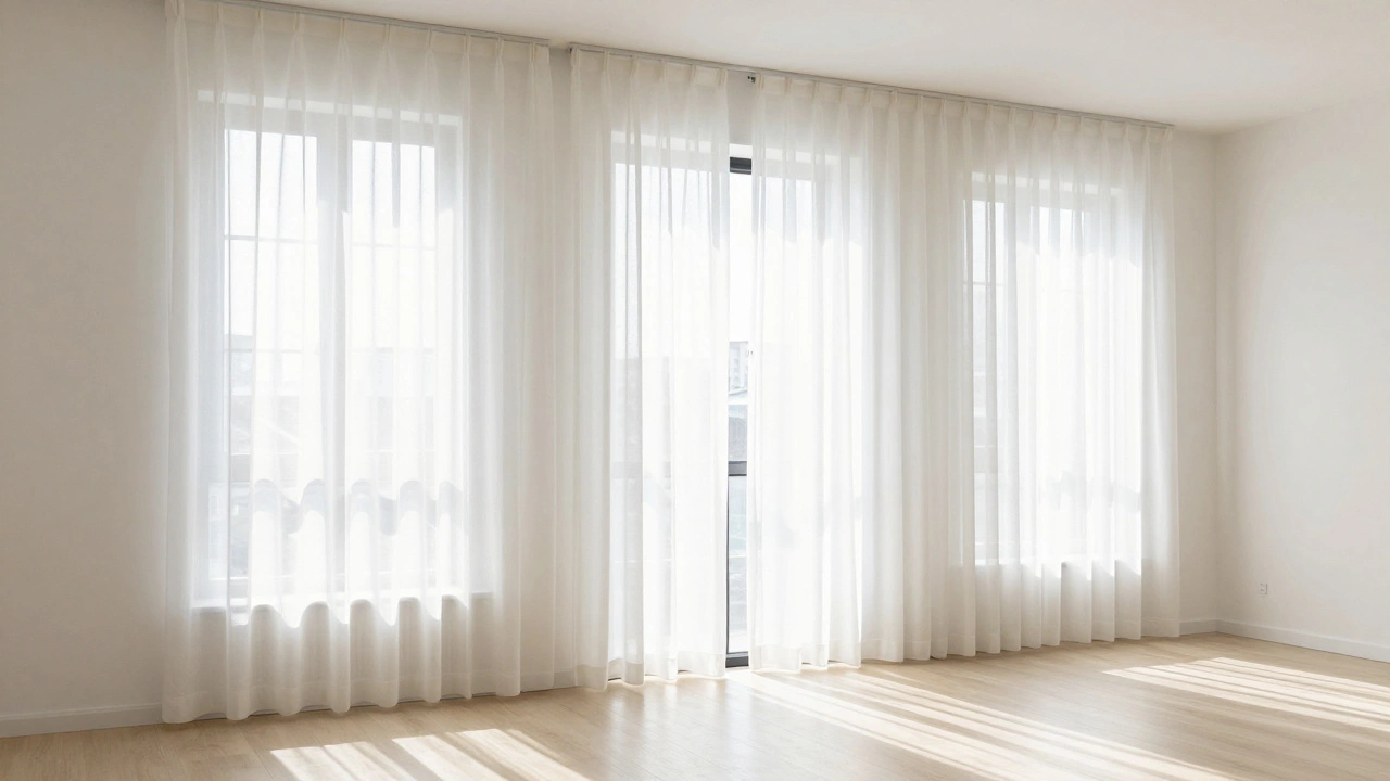
Instead, look for Sheer Curtains. These allow natural light to filter through while providing privacy. When sunlight can penetrate the fabric, the window remains a source of light rather than a wall of fabric. Linen is another fantastic choice. Its natural weave allows for a bit of breathability and a soft look that doesn't overwhelm a small area. If you need privacy at night, consider a layered look: sheers for the daytime and light-colored drapery for the evening.
Hanging Techniques to Cheat the Eye
The color of the curtain is only half the battle. Where you hang the rod determines how high the ceiling feels. If you hang your curtains right at the top of the window frame, you are highlighting exactly where the window ends. This creates a horizontal line that "cuts" the room in half.
To fix this, use the "high and wide" method. Mount your curtain rod 4 to 6 inches above the window frame-or even all the way up to the ceiling. By doing this, you draw the eye upward, emphasizing the vertical space. This makes the Ceiling Height feel greater than it is. Additionally, extend the rod wider than the window itself. When the curtains are open, they should frame the window without covering any of the glass. This lets in more light and makes the window appear larger, which in turn makes the whole room feel more expansive.
Common Pitfalls to Avoid
It is tempting to go for a bold pattern to "add personality" to a small room. However, large, busy prints-like giant florals or heavy geometric shapes-can actually shrink a room. They create a focal point that is too aggressive, making the walls feel like they are leaning in.
If you love patterns, stick to small-scale prints or subtle textures. A light-colored fabric with a very faint white-on-white weave adds interest without the bulk. Avoid dark-colored valances or heavy cornices at the top of the window. These act like a "lid" on your room, visually compressing the height and cancelling out the benefits of your light-colored fabric.
Putting It All Together: A Real-World Example
Imagine a 10x10 foot bedroom with a single north-facing window. The walls are painted a soft, cool gray. If the owner installs dark brown velvet curtains, the room will feel like a cozy cave-great for sleeping, but claustrophobic during the day. Now, swap those for light gray linen curtains hung 2 inches below the ceiling and 8 inches wider than the window frame. Suddenly, the wall and window merge into one continuous plane of light. The sunlight bounces off the light gray fabric and fills the corners of the room. The result isn't a different sized room, but a different feeling of space.
Do dark curtains always make a room look smaller?
Generally, yes. Dark colors absorb light and create a strong visual boundary that stops the eye, which defines the limits of the room more sharply. However, if you have a massive room that feels too empty or "cold," dark curtains can actually help the space feel more balanced and intimate.
What is the best color for a dark room with no natural light?
In rooms with very little light, stick to pure white or very light cream. Avoid "cool" grays, as they can look muddy or blue in low light. Pure white helps reflect whatever artificial light you have (from lamps or overheads), preventing the room from feeling like a cellar.
Can I use patterns if I want the room to look bigger?
Yes, but keep them subtle. Vertical stripes are particularly effective because they lead the eye upward, creating an illusion of height. Stick to light-colored stripes (like white and cream) rather than high-contrast ones to avoid creating a "jail cell" effect.
Should I use blinds or curtains to maximize space?
Curtains generally do a better job of adding height because of the way they can be hung from the ceiling. Blinds often end exactly at the window frame, which reinforces the room's boundaries. For the best of both worlds, use a light-colored blind for privacy and layer sheer curtains over them for that airy, expansive feel.
Does the fabric weight really matter?
Absolutely. Heavy fabrics like velvet or thick brocade have a visual "weight" that feels oppressive in small spaces. Lightweight fabrics like linen, cotton, or synthetics (like voile) feel breathable and light, which mentally translates to more open space.
Final Steps for Your Space
If you are still unsure about which shade to pick, grab a few fabric swatches and tape them to your wall. Look at them at different times of the day-morning light and evening lamp light change colors drastically. If the swatch disappears into the wall, you've found your winner.
For those dealing with extremely tight spaces, consider removing the curtains entirely and using frosted window film for privacy. This keeps the window completely open for light while maintaining your seclusion. If you stick with curtains, remember that the goal is to make the window look like a portal to the outside world, not a wall of fabric blocking your view.