Asymmetrical Art Placement Visualizer
Single Large Piece
Best for making a statement. Place above or near the largest furniture element.
High ImpactAsymmetrical Cluster
Create a gallery wall extending toward empty space to fill voids naturally.
DynamicHorizontal Line
Align pieces horizontally to create a grounded, expansive feel across the wall.
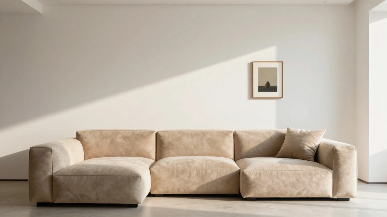
CalmingYou’ve hung your favorite piece of art, stepped back, and realized it looks completely wrong. The couch isn’t centered on the wall, so the artwork feels like it’s drifting off into space. This is one of the most common frustrations in living room design, a discipline focused on arranging furniture and decor to create functional, aesthetically pleasing spaces. Most people instinctively try to center art over furniture, but when that furniture is shifted for traffic flow or TV placement, that rule falls apart.
The good news? You don’t need a perfectly symmetrical room to have a stunning wall display. In fact, breaking the symmetry can make your space feel more dynamic and intentional. The key is shifting your focus from physical centering to visual weight, a concept in design where elements are balanced by their perceived heaviness rather than their actual size or position. Let’s walk through how to arrange art on an off-center wall without losing your mind.
Why Symmetry Fails in Real Homes
We’re taught early on that symmetry equals beauty. Museums, galleries, and staged homes love it because it’s easy to photograph and quick to understand. But real life rarely offers perfect walls. Your sofa might be pushed against a window, angled toward a fireplace, or placed to avoid a door swing. If you hang art directly above an off-center couch, two things usually happen:
- The art looks disconnected from the rest of the room.
- The empty wall space on one side feels awkward and unbalanced.
This happens because our eyes naturally scan rooms in patterns. We look at focal points first-usually seating areas, fireplaces, or large windows. When art doesn’t align with these anchors, it creates visual tension. Instead of fighting this tension, work with it.
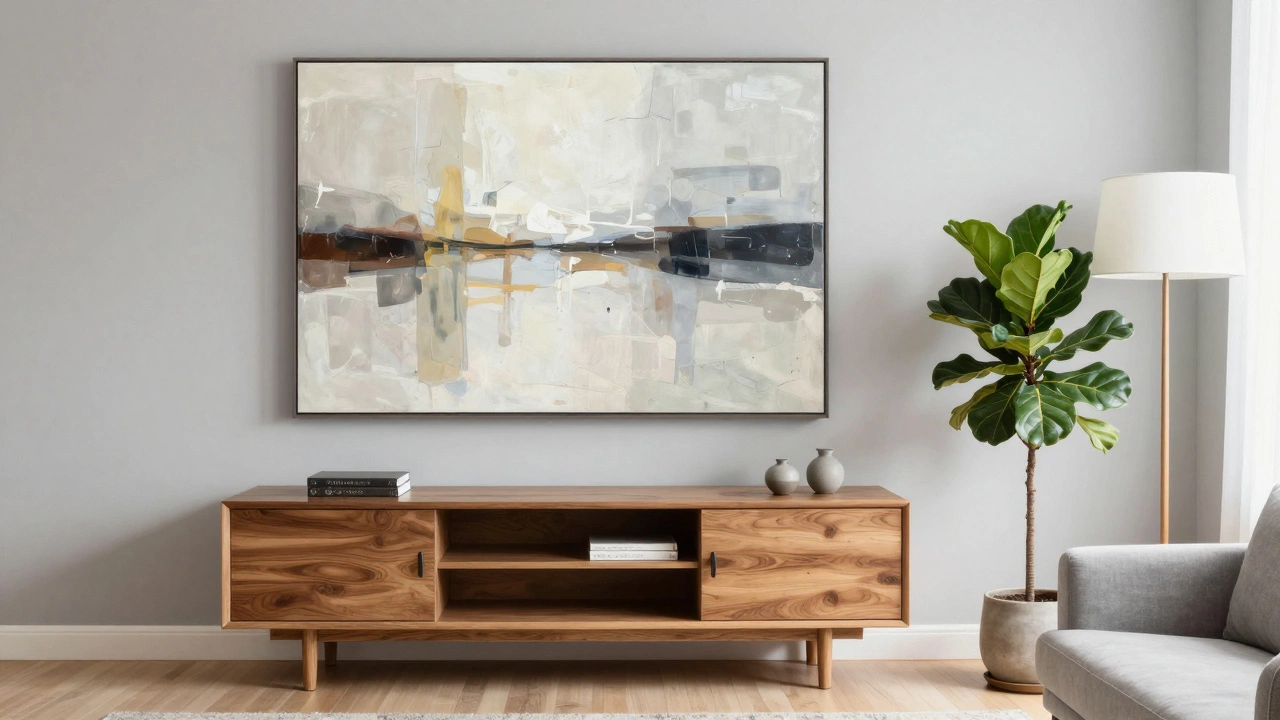
Rule #1: Anchor Art to the Largest Visual Element
If your couch isn’t centered, stop trying to use it as your primary anchor. Look for the next biggest visual element in the room. Is there a media console, a low storage unit typically used to hold televisions and entertainment devices? A tall bookshelf? A wide window? These objects carry more visual weight than a low-profile sofa and often sit closer to the true center of the wall.
Hanging your main artwork above or adjacent to this heavier element creates a natural grouping. For example, if your media console is slightly left of center, place a large horizontal piece above it. Then, add smaller pieces or shelves to the right to balance the composition. This technique works because it groups related items together, creating a cohesive vignette rather than isolated decorations.
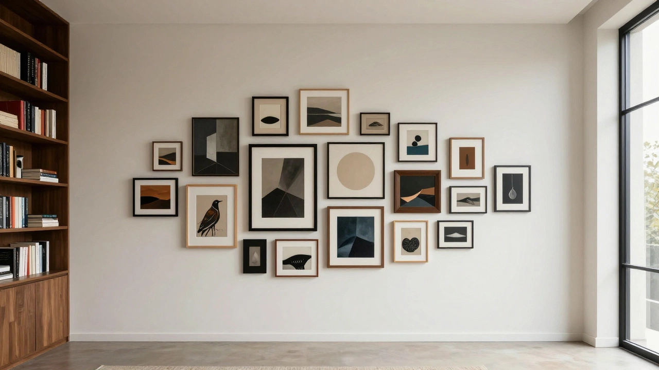
Rule #2: Use Groupings to Fill Empty Space
A single small painting on a large, off-center wall will always look lost. Instead, consider creating a gallery wall or a curated cluster. This approach allows you to control the overall shape and size of your display, regardless of where the couch sits.
| Strategy | Best For | Visual Effect |
|---|---|---|
| Symmetrical Grid | Formal spaces, uniform frames | Clean, organized, structured |
| Asymmetrical Cluster | Casual rooms, mixed media | Dynamic, personal, eclectic |
| Horizontal Line | Wide walls, panoramic views | Expansive, calming, grounded |
| Vertical Stack | Tall narrow spaces, high ceilings | Elegant, drawing eye upward |
An asymmetrical cluster is particularly effective here. Start with your largest piece near the center of the available wall space (not necessarily the room). Arrange smaller pieces around it, extending outward toward the edges of the wall. Keep the total width of the group between 50% and 75% of the wall’s width. This ensures the arrangement feels substantial without overwhelming the space.
Rule #3: Balance with Furniture and Lighting
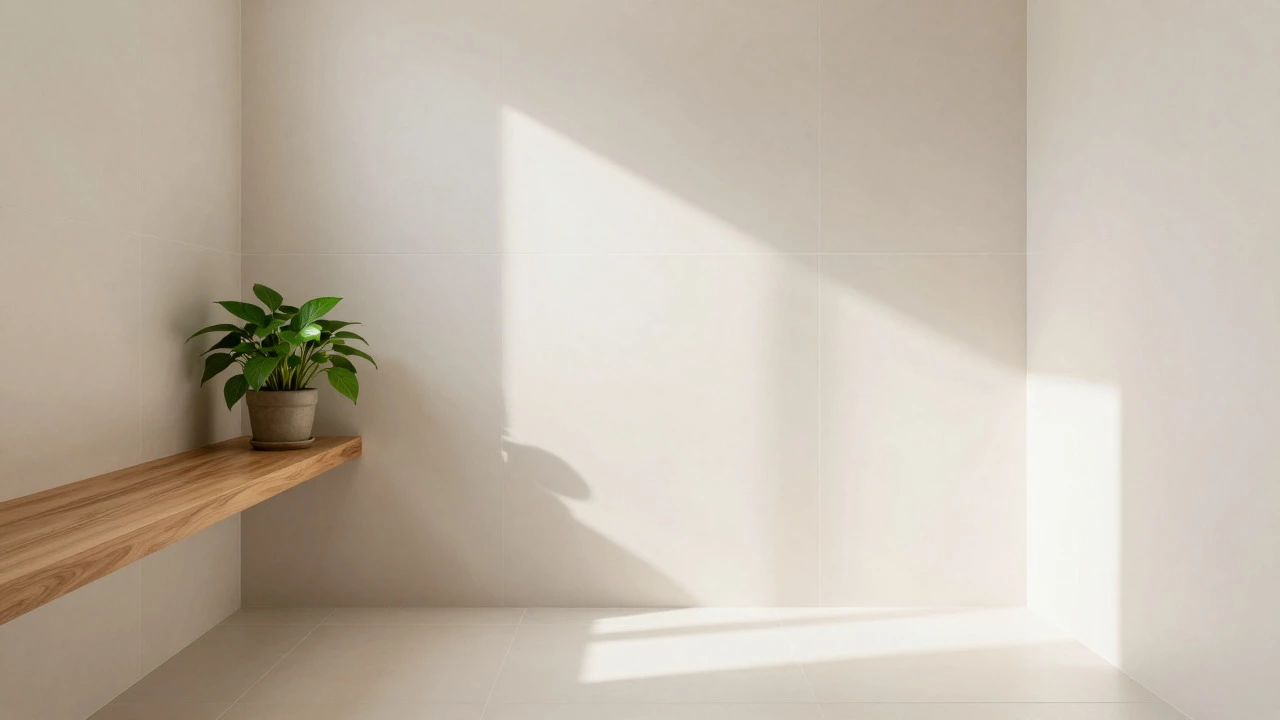
Art doesn’t exist in a vacuum. If your couch is off-center, use other elements to counterbalance the visual weight. Place a floor lamp on the opposite side of the wall from your main art piece. Add a side table with a decorative object. Even a potted plant can serve as a visual anchor.
Think of your wall as a scale. If the heavy art is on the left, you need something with comparable presence on the right. It doesn’t have to be another painting-it could be a mirror, a shelf, or even a textured rug under a chair. The goal is to distribute interest evenly across the room so no single area feels neglected.
Rule #4: Play with Scale and Proportion
One mistake people make when dealing with off-center walls is choosing art that’s too small. They think, “Since the couch isn’t centered, I’ll just hang a little picture somewhere.” This never works. Small art gets lost in large negative space.
Instead, go big. A single oversized canvas or photograph commands attention and can stand alone even if it’s not perfectly aligned with the furniture below. If you prefer multiple pieces, ensure the combined mass of the group is significant. Measure your wall first. Calculate the total square footage of the open space. Aim for art that covers at least 60% of that area.
For instance, if you have a 10-foot wide wall with 8 feet of usable space after accounting for doors and windows, your art grouping should span roughly 5 to 6 feet. This proportion creates harmony regardless of alignment.
Rule #5: Embrace Imperfection Intentionally
Finally, remember that perfection is overrated. Some of the most interesting interiors feature deliberately unbalanced arrangements. Think of a vintage map hanging crookedly beside a sleek modern print. Or a collection of framed botanical prints arranged in a loose diagonal line.
These arrangements work because they feel human. They suggest curation rather than calculation. Don’t be afraid to experiment. Move pieces around before committing to nails. Use painter’s tape to outline positions on the wall. Step back frequently. Ask yourself: Does this feel right? Does it draw the eye comfortably through the room?
If the answer is yes, then you’ve succeeded-even if the math says otherwise.
Common Mistakes to Avoid
Even with the best intentions, certain pitfalls can ruin your effort. Here are the top errors to watch for:
- Centering art over the wall instead of the furniture: This creates a disconnect between seating and decoration. Always prioritize the relationship between what you sit on and what you see.
- Ignoring sight lines: Ensure your art is visible from key vantage points, especially the main seating area. If you can’t see it clearly from the couch, reconsider its height or position.
- Overcomplicating the layout: Too many small pieces can look cluttered. Stick to three to five major elements unless you’re experienced with gallery walls.
- Using inconsistent framing: While mixing styles is fine, maintain some consistency in matting, frame color, or spacing to unify the group.
Final Thoughts on Asymmetrical Beauty
Arranging art on an off-center wall isn’t about fixing a problem-it’s about embracing opportunity. By letting go of rigid rules and focusing on balance, scale, and intentionality, you can create a space that feels both polished and personal. Your home doesn’t need to follow textbook proportions to be beautiful. It just needs to reflect your taste and comfort.
So grab your level, measure twice, and hang with confidence. The best designs aren’t always the most symmetrical-they’re the ones that make you feel at home.
How high should I hang art when the couch is off-center?
Hang the center of your artwork approximately 57 inches from the floor. This standard height aligns with average eye level and works well regardless of furniture placement. If your couch is significantly lower or higher, adjust slightly-but keep the range between 55 and 60 inches for optimal viewing.
Can I hang art above a TV that’s not centered?
Yes, but treat the TV as part of the composition. Choose art that complements the screen’s width and style. Leave at least 6-12 inches of space between the top of the TV and the bottom of the frame. Avoid overly busy images that compete with the screen’s content.
What if my wall has architectural features like windows or doors?
Use these features as boundaries. Frame your art within the clear wall space between them. If possible, align the outer edges of your art group with the inner edges of the window or door trim. This creates a built-in sense of order and containment.
Should I match the art style to the couch fabric?
Not necessarily. Matching exactly can look dated. Instead, pick up secondary colors or textures from the upholstery. For example, if your couch has blue accents, include blues in your art palette. This creates cohesion without being restrictive.
Is it okay to leave one side of the wall completely bare?
Only if the rest of the room balances it. A bare wall can feel stark unless countered by furniture, lighting, or decor elsewhere. Consider adding a tall plant, a narrow console table, or a statement light fixture to fill the void visually.