Cozy Room Color Selector
Selected Room & Color
Cozy Color Guide
Neutral, reflective, intimate
Subtle warmth, cozy dining
Nature-inspired, calming
Cocoon-like, accent wall
Cheerful, subtle pop
Modern, snug backdrop
Tips for Coziness
- Use warm lighting (2700–3000K) to enhance warm colors
- Add textured elements like linen or wood
- Choose matte or flat finishes for softness
- Test colors at different times of day
- Consider room function when selecting hues
Did You Know?
Rooms painted in warm, earthy hues can reduce heart rate by up to 8% according to environmental psychology research.
Ever walked into a space and instantly felt relaxed, like the room wrapped you in a warm hug? The secret often lies in the color on the walls. Picking the right hue can turn a bland square into a snug retreat, whether it’s a living room, bedroom, or home office. Below we break down which colors naturally create a cozy atmosphere, how to pair them with light and texture, and practical steps to apply them without guessing.
Why Color Affects Coziness
Color isn’t just a visual treat; it triggers emotional responses. Warm tones tend to raise the feeling of comfort, while cool tones can feel more spacious but less intimate. When you choose a shade, you’re essentially setting the room’s mood.
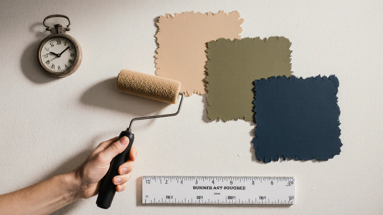
Cozy paint colors are a group of pigments that evoke warmth, softness, and a sense of belonging. They usually have low to medium saturation and can be either warm or muted cool. The goal is to soften hard edges and invite lingering.
Research from the Journal of Environmental Psychology shows that rooms painted in warm, earthy hues can reduce heart rate by up to 8%, proving that the right color really does calm the body.
Top Colors That Instantly Make a Room Feel Cozy
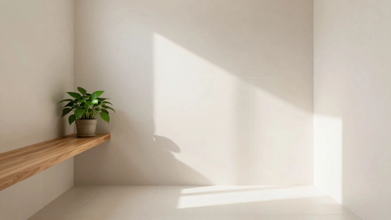
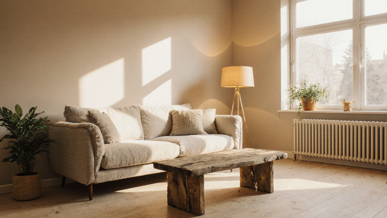
- Warm beige - A neutral that reflects natural light, making spaces feel larger yet still intimate. Perfect for living rooms with lots of wooden furniture.
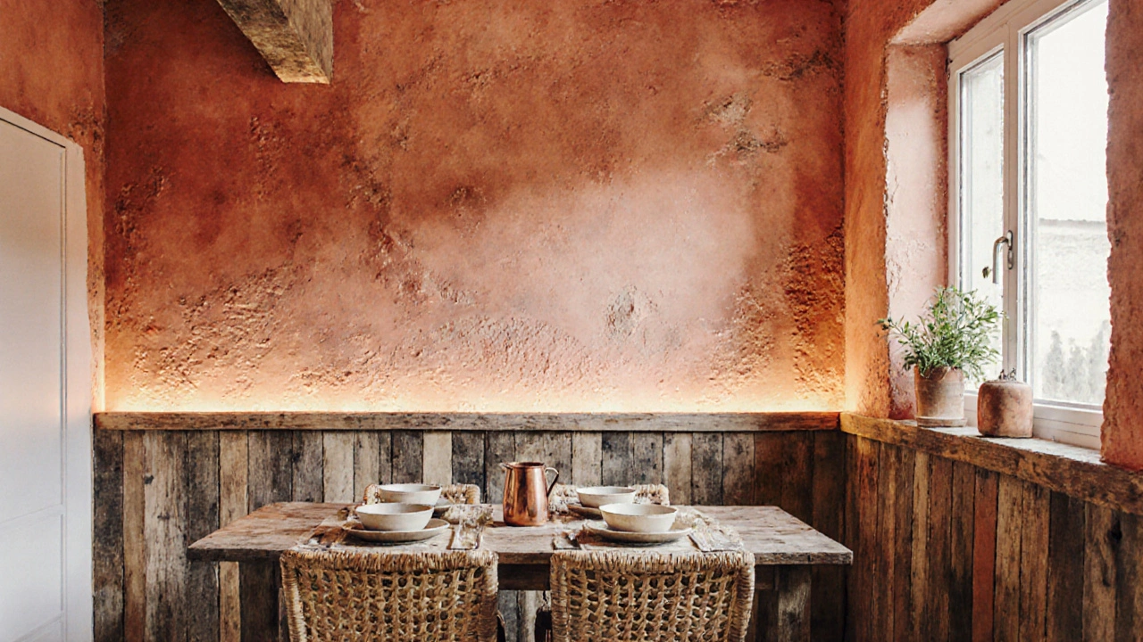
- Soft terracotta - Adds a subtle reddish warmth without overwhelming. Works wonders in kitchens and dining areas where meals are shared.
- Muted olive green - Brings the calming vibe of nature indoors. Ideal for bedrooms and study corners.
- Deep navy - A dark cool tone that creates a cocoon‑like effect, especially when paired with warm lighting. Great for accent walls in lofts.
- Dusty mustard - Gives a cheerful yet subdued pop, perfect for adding optimism to small rooms.
- Charcoal gray - Provides a modern, snug backdrop that makes plush furniture stand out.
Notice that each hue sits in the lower saturation range; that softness is what prevents the color from feeling harsh or clinical.
How Light, Texture, and Finish Shape Coziness
Even the perfect pigment can feel cold if the lighting is harsh or the surface is glossy. Consider these three variables together:
- Lighting - Warm LED bulbs (2700-3000K) amplify the snug feeling of warm colors. In rooms with limited natural light, add floor lamps with fabric shades to diffuse the glow.
- Texture - Rough plaster, linen curtains, or reclaimed‑wood panels add tactile depth, reinforcing the psychological warmth of the hue.
- Paint finish - Matte or flat finishes absorb light, creating a softer look, while satin can be used on high‑traffic areas to maintain durability without reflecting too much shine.
Combine a matte warm beige with a linen sofa and a soft amber table lamp, and you’ll instantly notice the room feels more inviting.
Choosing the Right Shade for Specific Spaces
Not all rooms benefit from the same cozy shade. Here’s a quick guide:
- Living room - Warm beige or soft terracotta provides a universal backdrop that lets furniture shine.
- Bedroom - Muted olive or dusty mustard fosters relaxation while keeping the space from feeling too bright.
- Home office - Deep navy or charcoal gray reduces glare and improves focus, especially when paired with a bright desk lamp.
- Bathroom - Light warm gray with a matte finish feels spa‑like; add a teal accent tile for a subtle splash of comfort.
Before committing, paint a 12‑inch square on opposite walls. Observe the color at different times of day; the shade that feels most soothing at dusk is usually the best pick for coziness.
Warm vs. Cool Colors: A Side‑by‑Side Comparison
| Aspect | Warm Colors | Cool Colors |
|---|---|---|
| Psychological Effect | Invokes comfort, intimacy, and energy. | Creates calm, spaciousness, and sometimes detachment. |
| Best For | Living rooms, kitchens, bedrooms with limited light. | Bathrooms, offices, spaces with abundant natural light. |
| Typical Hues | Beige, terracotta, mustard, olive. | Navy, charcoal, muted teal, soft slate. |
| Lighting Needs | Warm LED or incandescent to enhance glow. | Cool white or daylight LEDs to avoid gloom. |
| Suggested Finish | Flat or matte for softness. | Satin for subtle reflection without harshness. |
Both families can be cozy-just pair them with the right lighting and texture. If you love navy but worry it feels cold, add a warm‑toned rug or a golden wall sconce.
Cozy Color Planning Checklist
- Identify the room’s primary function (relax, work, entertain).
- Measure natural light exposure; rooms with <20% window area benefit from warmer hues.
- Choose a paint finish: flat for softness, satin for durability.
- Select complementary textures (linen, wood, woven rugs).
- Pick lighting fixtures with warm Kelvin ratings (2700‑3000K).
- Test a paint sample on multiple walls, observe at sunrise, noon, and sunset.
- Finalize by adding one accent piece in a contrasting yet harmonious shade.
Following this checklist keeps the process organized and prevents costly repainting later on.
Frequently Asked Questions
Can a dark color still feel cozy?
Yes. Dark shades like deep navy or charcoal create a cocoon effect when paired with warm lighting and soft textures. The key is to balance darkness with illumination so the room doesn’t feel oppressive.
What finish should I use for a bedroom?
A flat or matte finish is ideal for bedrooms because it absorbs light, reduces glare, and enhances the soft vibe of cozy colors like muted olive or dusty mustard.
Do I need to repaint the ceiling when I change wall colors?
Not necessarily. If the ceiling is already a neutral white, it will reflect the new wall hue and keep the room bright. For very dark walls, consider a light‑reflective ceiling to avoid a cave‑like feel.
How much paint will I need for a 12×12 room?
A standard 1‑gal (3.8L) can cover roughly 350sqft with one coat. For a 12×12 room (144sqft) plus ceiling, two coats are recommended, so one gallon is usually sufficient. Always buy a little extra for touch‑ups.
Should I use neutral paints for a modern look?
Neutrals like warm beige or soft gray work well in modern interiors, but add texture-such as a textured plaster or wood paneling-to keep them from feeling sterile. Pairing a neutral base with a warm accent wall can bridge modern clean lines and cozy comfort.